The American Savings Bank, or ASB, began its journey as a financial institution on September 7, 1922, in Hawaii, USA. Over the years, it has grown steadily in the islands by offering a diverse range of products. In fact, today, it has emerged as the third-largest bank in Hawaii, USA. The visual representation of the bank is depicted by the kalo leaf, aka Colocasia esculenta, which used to appear on the crown of the local king, King Kalakaua. This article explores the history and evolution of the logo of the American Savings Bank, among other details of the bank.
The Genesis of the American Savings Bank Logo (2002 – Present)
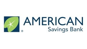
The logo of the American Savings Bank featured the iconic kalo leaf, or more commonly, the taro leaf, which has Hawaiian origins dating back centuries. The choice of kalo leaf was deliberate in order to refer to the deep roots of the bank in the Hawaiian Islands. It also symbolised the commitment of the bank to nurturing growth, strength, and prosperity for the local community.
The symbolism of the kalo leaf lies in the fact that it perpetuates life across generations after sprouting up from the ground. In the same vein, the American Savings Bank aims to help families and businesses flourish and thrive in the region. Besides, the vibrant yet serene colour palette of green, blue, and white of the kalo leaf evokes a sense of natural harmony, stability, and continual growth. Thus, the kalo leaf became the perfect visual representation of the essence and values of the bank.
The Elements of the American Savings Bank Logo
Font
The wordmark featured in the American Savings Bank logo is written using a clean and highly legible sans-serif typeface. In the wordmark, “American” is written in large uppercase letters, while “Savings Bank” is written in small lowercase letters. However, the “S” and “B” of “Savings Bank” were written in capitals.
Colour
The overall logo of the American Savings Bank has a serene and relaxed colour palette consisting of blue, green, and white. The blue colour represents ideals like confidence, intelligence, and trust, while the green colour evokes natural imagery like growth and renewal. Finally, bright white accents in the shape of a star provide a crisp contrast to the green leaf and its blue background.
Finally
In the two decades since its introduction, the kalo leaf has become an instantly recognisable symbol of the American Savings Bank. It is the brand identity and unique value proposition for the Hawaiian community. In fact, more than just a logo, the kalo leaf is a constant reminder of the deep local roots and mission of the bank. It symbolises the aim of the bank: to nourish the financial growth and prosperity of its customers.