American Eagle is an apparel brand that has become synonymous with casual and youthful fashion. Founded by brothers Jerry and Mark Silverman in 1977, the product line of American Eagle Outfitters encompasses a wide range of items, such as jeans, t-shirts, sweaters, outerwear, swimwear, and various other clothing options.
The brand focuses primarily on capturing the attention of a younger demographic, specifically college and university students. Its logo encapsulates the spirit of freedom and individuality. The article explores the evolution of the American Eagle logo over the years, among other details of the company.
The Genesis of the American Eagle Logo (1977 – 1985)
The original American Eagle logo featured a straightforward but eye-catching image of an eagle in flight set against a circle representing the sun. The logo was split into two parts, with the top part highlighting the brand name, while the line below resembled a hill. The size of the brand name, written in uppercase and in an artistic serif typeface, changed based on its placement to fit the hill below.
The glyphs of the letters were heavy and bold, while the serifs had unusual shapes, especially the letters “E” and “L”. Also, beneath the eagle was mentioned “Outfitters” in a fancy script with swirls with a long horizontal line underneath.

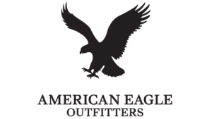
(1985 – 2018)
In 1985, American Eagle made minor adjustments to the logo as it strengthened its market position and increased the range of products it offered. During this time, the company adopted the eagle as a representation of American youth’s carefree and adventurous spirit. Besides, the image of the swooping eagle catching its prey emphasised the dynamism and energy of the brand. The brand name “AMERICAN EAGLE OUTFITTERS” was written below the eagle motif in a smooth and thin uppercase serif typeface in two levels.
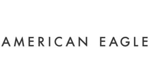
(2018 – Present)
The 2018 logo iteration saw the eagle motif removed while keeping the brand name as the logotype in uppercase. Executed in a geometric sans-serif typeface, the individual letters had adequate spacing between them. The logotype in black looks modern to convey the brand’s ability to grow.
The Elements of the American Eagle Logo
Font
The American Eagle logo features bold uppercase lettering crafted in an elegant serif font. It is characterised by distinctive contours and sharp serifs. The font closely resembles either Walbaum Pro 06pt Regular or Carot Text Medium, with minor adjustments to the characters’ outlines.
Colour
In terms of the colour palette within the American Eagle visual identity, a deep shade of blue takes centre stage. This unconventional choice for the fashion industry sets the brand apart from its competitors. It added a unique and distinguishable element to its visual presence.
Finally
The history and evolution of the American Eagle logo tell a compelling story of a brand that has successfully navigated the ever-changing currents of the fashion industry. From its early days as a denim-focused label to its current status as a lifestyle brand promoting diversity and inclusivity, the American Eagle logo has been a visual anchor for its identity.