American Apparel is a renowned American clothing company that was founded in 1989 by a Canadian entrepreneur, Dov Charney. It began as a small wholesale business in North Carolina and focused on producing high-quality, American-made basic garments such as T-shirts. The company relocated to Los Angeles in 1997, where it grew from a wholesale supplier to a popular retail brand.
American Apparel is known for its commitment to ethically manufactured, sweatshop-free clothing produced domestically in the United States. The logo of the company has remained consistent since its founding in 1989. The article looks into the American Apparel logo and various aspects related to it, among other details of the company.
The Genesis of the American Apparel Logo (1989 – Present)
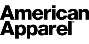
The American Apparel logo is text-based and features the brand name in two ways. The first one features the brand name in a single line, while the other features the brand name in two levels – both in a title case. Bold and eye-catching, the minimalist brand name is executed using a modern and grotesque sans-serif typeface, which gives it a stylish look. Designed in black and set against a white background, the logo design evokes a sense of modernity and confidence.


The Elements of the American Apparel Logo
Font
The logotype of American Apparel is written using a modern, grotesque sans-serif typeface developed by Max Miedinger to convey a contemporary and stylish appearance. It is similar to Helvetica Black and Bold.
Colour
The logotype is designed using black and set against a white background to create impact.
Finally
The American Apparel logo has not changed since the time of the founding of the company. It has consistently mirrored the journey of the brand from a bold, countercultural startup to a modern, ethically conscious fashion icon. Throughout its timeline, the logo has maintained a minimalist and typographic style. The logo is a reflection of the company’s focus on simplicity, authenticity, and timeless design.