AMD, or Advanced Micro Devices, is a US-based manufacturer of computer processors. Established in 1969, the company’s products are designed for servers, desktop computers, laptops, and gaming consoles. Its main rivals are NVIDIA and Intel, and the company, besides being a titan in the semiconductor industry, has maintained a consistent and symbolically rich brand identity.
The AMD logo is known for its iconic arrow motif, which has evolved subtly over the decades. The logo reflects the unwavering commitment of the company to progress and innovation while simultaneously preserving its heritage. The article delves into the evolution of the AMD logo, among other details.
The Genesis of the AMD Logo (1969 – Present)
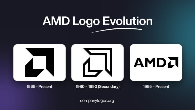
The original logo was designed by Larry Bender, and it featured large and small arrowheads placed in opposite directions. These arrowheads could be interpreted as two right angles facing opposite directions but together forming what resembled a lowercase “a.” This nuanced design stood out visually and represented the pioneering spirit of AMD.
Designed in black, suggesting power and authority, the logo symbolised movement, momentum, and technological progress. Also, the arrows created a white square at the centre to symbolise an integrated circuit or chip, thereby establishing the focus of the company.

(1980 – 1990) (Secondary)
During the 1980s, AMD introduced a slightly revised version of its original emblem. Here, the core arrow motif remained, but with slight modifications. For instance, the arrows became white with a bold black outline, thereby providing a lighter and more modern appearance. The black lines around the arrows became more prominent, and the arrows themselves became a bit bolder.

(1995 – Present)
In the mid-1990s, AMD began integrating a wordmark into the logo. As a result, it paired the iconic arrow emblem with the “AMD” initials in a bold, sans-serif typeface in uppercase. The chosen font echoed boldness and geometric simplicity, which aligned with technological strength. The latest design is both modern and minimalistic, and it evokes a sense of power, confidence, and expertise.

The Elements of the AMD Logo
Font
The stable wordmark of the AMD logo is rendered in a modern geometric sans-serif typeface with distinctive contours of the letters. The font is similar to Gill Sans Bold or Humanist 521 Bold.
Colour
The colour palette of the AMD logo comprises black and dark green. The deep colour shades evoke a sense of loyalty and trustworthiness and reflect the values of professionalism and stability.
Finally
Unlike many corporate logos that have undergone dramatic transformation, the AMD logo has remained reassuringly consistent yet adaptable. Each logo evolution, from the bold black arrow of 1969 to the minimalist monochrome symbol of today, has continued to represent AMD’s pioneering ethos, relentless drive for innovation, and position as a trusted leader in the tech world.