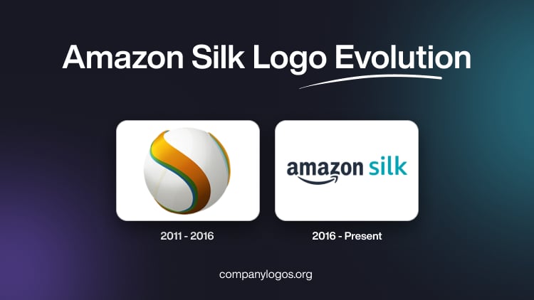
Amazon Silk is a specialised, cloud-accelerated browser that is designed for the Amazon ecosystem. While it did not become a mainstream browser, it remains an integral part of Fire tablets and Fire TV. The Amazon Silk logo has evolved since the browser’s debut in 2011. It moved from being a standalone identity to being an integral part of Amazon’s unified brand system. The key logo changes occurred in 2011 and 2016. The article delves into the evolution of the Amazon Silk logo, among other details of the company.
The Genesis of the Amazon Silk Logo (2011 – 2016)
When the Amazon Silk browser was launched in 2011 for the Kindle Fire, it featured a distinct wordmark emphasising the lowercase word “silk” with smooth lines in orange colour. Below it was mentioned the word “BROWSER” in white uppercase. To the left of the wordmark was positioned an emblem consisting of a white ball-like element.
Further, an orange and green coloured ribbon-like element was wrapped around the ball to resemble the letter “S”. The original Amazon Silk logo design sought to convey speed, fluidity, and advanced technology, and it positioned Silk as both lightweight and innovative.

(2016 – Present)
In 2016, Amazon Silk underwent a visual update. It began to incorporate more explicit connections to Amazon’s main corporate identity. These often include the Amazon wordmark or subtle echoes of the iconic Amazon smile-arrow. Here, the wordmarks “amazon” and “silk” are placed side-by-side in lowercase and in black and light green colours, respectively. The arrow sign, reminiscent of the original Amazon logo, appears in black. The emblem “S” with pointed ends was redesigned in gradient orange against a white background. The bottom end of the letter “S” shows the colour grey as a shadow.


The Elements of the Amazon Silk Logo
Font
The font used to render the Amazon Silk logo is Amazon Logo Sans. It was developed for Amazon’s 2025 global rebrand as an evolution of the earlier Amazon Ember typeface. Amazon Sans is a logo font that is proprietary and has been designed to unify Amazon’s visual system and provide excellent legibility on digital platforms. The wordmark in the earlier versions of Amazon Silk was written using a lighter and rounded sans-serif typeface.
Colour
The colour scheme used to design the Amazon Silk emblem features Smile Orange (a specific Amazon brand orange). The text (including the Silk name) typically appears in black and light green, respectively. It reinforces clarity and accessibility. The colour Smile Orange is chosen for its warmth, friendliness, and brand distinctiveness.
Finally
The evolution of the Amazon Silk logo reflects the browser’s role within Amazon’s ecosystem. It is simple, lightweight, and service-driven rather than flashy or competitive in the broader browser market. Unlike major browsers such as Chrome or Firefox, Silk never relied on a highly distinctive standalone symbol; instead, its branding evolved to remain harmonious with Amazon’s wider design language. This makes it a streamlined, cloud-optimised browser tailored to enhance Amazon’s devices and services.