AllTrails is a popular mobile application that is dedicated to fitness and outdoor enthusiasts. Available in four languages, it offers users a range of information, including trail maps and photos to help in outdoor activities, such as mountain biking, hiking, and running, among others. Established in 2010, the digital platform helps adventurers in the USA, Canada, and elsewhere with insights and an expansive list of trails.
It had a modest beginning and has now become a global leader in trail mapping and outdoor adventures. The logo of All Trails has been an iconic representation of this transformative journey. In fact, it has undergone a few adaptations to reflect the growth and values of the company. The article delves into the evolution of the AllTrails logo, among other details of the application.
The Genesis of the AllTrails Logo (2010 – 2017)
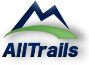
The logo of AllTrails embodies the essence of hiking and outdoor adventure, thanks to its vibrant shades of green and blue. The logo comprises a graphical image of a mountain drawn with clean brush strokes in a shade of blue. The jagged peaks and rugged terrain shown in the graphical image evoke the kind of majesty that nature adventurers pursue. Just beneath the imagery of the mountains is an arched green swoosh to symbolise the raw and idyllic natural environment.
Besides the graphical imagery of the mountain, the logo has the brand name “AllTrails” mentioned below. The wordmark is written in a bold sans-serif typeface in a shade of blue. It exudes a feel of trustworthiness and reliability.
(2017 – 2023)
The logo was redesigned in 2017 with the mountain peak shown in a shade of green. Overall, the logo is a study in minimalism and contrast and aligns with the brand’s overall vision of achievement and adventure. The majestic and jagged mountain peaks convey the challenges or obstacles that are required for one to succeed. The wordmark in this iteration has been shifted to the right of the graphical imagery of a mountain.
The wordmark is mentioned in bold letters in grey shades to counterbalance the imagery of the mountain. It tells us that outdoor adventures or explorations are thrilling but need to be meticulously planned while using the app.

(2023 – Today)
During this period, AllTrails continued to refine its brand identity. This particular logo iteration appears fully in green and conveys the attributes of rejuvenation and vitality. The graphical imagery of the mountain has been refined to look simple yet abstract and minimalist. It represents the lofty mountains that nature enthusiasts can dare to climb to go on a trail through its rugged terrain.
It can also serve as a metaphor for the real mountains or challenges that one can encounter and go on to conquer with grit and determination. The twin peaks symbolise the great outdoors and are a beckoning call for nature explorers to see the things that are present beyond the horizon.
The wordmark “AllTrails” appears alongside the graphical imagery of a mountain as an anchor. The dot over the letter “i” seems to mark the location and shows the navigation capabilities of the application. The overall logo reminds adventure seekers and outdoor explorers to experience the wonderful trails that nature offers.

The Elements of the AllTrails Logo
Font
The typography of the wordmark displaying the brand name is bold and modern sans-serif. It represents the beauty of the natural world, which is both majestic, awe-inspiring, scary, fulfilling, and magical. The grotesque style and geometric forms of the logo evoke stability and reliability.
Colour
The various logo iterations appear in shades of green, blue, and grey to convey the verdant green terrain that is pursued by adventure seekers.
Finally
Over the years, the AllTrails logo has represented the values of adventure, exploration, and appreciation for nature. Each logo iteration has built upon the previous one to reflect the growth of the company and its ability to adapt to the changing needs and preferences of its user community. So, from its minimalist beginnings to its current sleek and inclusive design, the AllTrails logo has become a recognisable symbol of outdoor enthusiasm. It guides adventurers on their journeys through the wilderness.