The article deals with the evolution of the AllSaints logo, among other details.
The Genesis of the AllSaints Logo (1994 – Present)
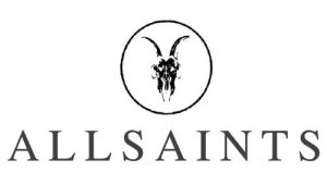
The AllSaints logo combines a graphical element and a wordmark. The graphical element constituting a ram skull design is depicted as half-erased. The skull design appears at the centre of a circle and conveys strength and resilience, the core concept of the brand. In other words, the brand signifies the fact that its clothing line is for people who are not afraid to stand out and look for freedom in their style choices. The ram skull also symbolises eternity as the brand seeks to transcend fleeting trends. The circle enclosing the skull symbolises a sense of unity and completeness. In a way the circle highlights the significance of each element in the emblem.
The wordmark in black, however, tends towards a more generic aesthetic. It employs a straightforward serif typeface with ample spacing between the letters. The uppercase AllSaints logotype utilises a typeface that is strikingly reminiscent of Times Ten Roman and Hebrew Vilna Tanach Black.
The Elements of the AllSaints Logo
Font
The uppercase wordmark in the AllSaints logo is executed in a simple serif typeface with adequate spacing between the letters. The typeface is similar to Times Ten Roman and Hebrew Vilna Tanach Black.
Colour
The logo is presented in black against a white background.
Finally
The AllSaints logo is more than a mere visual identifier; it is a narrative of the brand’s evolution. It is a story that is told through typography, symbolism, and artistic collaboration.