Allison Transmission is a leading US-based manufacturer of automatic transmissions and hybrid propulsion systems for heavy-duty vehicles. Established in 1915, the company also manufactures special equipment for airfield, municipal, and quarry operations, as well as equipment for oil and gas exploration.
The logo of the company has undergone a few changes since the establishment of the company. These changes reflect the design trends, corporate identity, and market positioning of the brand. The current logo has a modern look and feel but has uncanny similarities with the old Pepsi logo. This article explores the evolution of the Allison Transmission logo through the years, among other details.
The Genesis of the Allison Transmission Logo (1915 – 1930) (Unavailable)
The company didn’t have a formal logo when it was founded by James A. Allison in 1915. During this period, the name of the company used to be typically written in plain text on documents and product packaging. There is no mention of the logo during this stage, as the focus of the company was primarily on establishing the business and developing its reputation in the automotive industry.
(1930 – 1956)
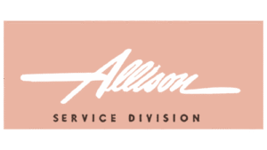
The first documented logo of the company featured a handwritten cursive-style wordmark comprising the brand name “Allison” in white set against a light brown background with a gradient. Interestingly, the crossbar of the letter “A” in uppercase and the end of the letter “n” in lowercase were extended on the left and right, respectively. Also, below the wordmark was written “SERVICE DIVISION” in a bold serif typeface.
(1956 – 1999)
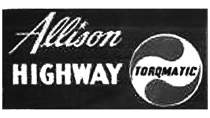
The 1956 logo iteration had a roundel with the word “TORQMATIC” in bold set against a wave-like background of grey and white. Beside the roundel were the words “Allison” and “HIGHWAY” featured against a black background. The word “Allison” was quite similar to its previous avatar, but without the extended crossbar. On the other hand, the word “HIGHWAY” was slightly bigger and was rendered in white.
(1999 – Present)
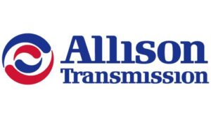
The present-day logo comprises a roundel in blue and red set against a white background. The roundel contains a smaller replica of itself, and both roundels are formed by curved drops in red and blue. They represent the circular elements that are often part of the transmission systems in vehicles. Moreover, the design typically appears like yin and yang to represent continuous motion.
Alongside the roundel are the wordmarks “Allison” and “Transmission,” written in two different levels and sizes. A distinct characteristic of the wordmarks is the absence of the dot mark over the letter “i”. Interestingly, the logo design has uncanny similarities to the logo of Pepsi, the popular soft drink. The current logo effectively balances the heritage of the company with a modern and dynamic look that reflects its position as a leader in transmission technology.
The Elements of the Allison Transmission Logo
Font
The wordmark in the Allison Transmission logo features a distinct and impactful serif typeface. The letters of the typeface are characterised by their bold strokes and refined appearance. And with softened edges, they offer a modern touch to the classic serif style. The typeface is known for its visible serifs, particularly the lack of dot marks on top of the letter “i.” The font has similarities to Republic Standard Bold or Prima Serif Standard Bold.
Colour
The colour scheme of the Allison Transmission logo primarily utilises deep and rich shades of blue and red against a crisp white background. Here, the deep blue shade conveys professionalism, trustworthiness, and stability, qualities that are crucial for a company in the automotive transmission industry. The vibrant red shade adds a touch of energy and passion, and suggests the company’s drive for innovation and excellence. The white background ensures high visibility and readability and offers a clean and modern feel.
Finally
The evolution of the Allison Transmission logo reflects the journey of the company from a small engineering firm to a global leader in transmission technology. Each iteration of the logo has reflected the design trends of its time. At the same time, it maintained elements that represent the core values of strength, reliability, and forward-thinking embodied by the company.