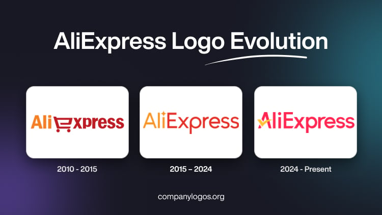
AliExpress is a popular Chinese online retail platform that connects small and medium-scale businesses in China with buyers from all over the world. Founded in 2010, it is the retail arm of the Alibaba Group and has grown to become one of the largest online marketplaces globally. The logo of AliExpress has been its visual identity over the years and has gradually evolved in line with the company’s growth and changing ambitions. The article explores the journey of the AliExpress logo over the years, among other details of the company.
The Genesis of the Ali Express Logo (2010 – 2015)
The initial logo design of AliExpress had the name “AliExpress” written in a bold sans-serif Franklin Gothic font. The company used modern and clean typography to show its status as a trustworthy and contemporary platform for online shopping. The colour palette used in the typography was carrot orange and lust red to evoke feelings of vibrancy and reliability. Interestingly, the letter “E” was replaced by the icon of a shopping cart. The early logo successfully introduced AliExpress as a fresh and trustworthy site to access products directly from sellers in China.

(2015 – 2024)
The company saw huge growth in its user base, sellers, product categories, and regional operations. To keep pace with the developments, the logo was refreshed in 2015 by Alexander Nazarenko. Thus, while the original typography and colour palette remained, the new logo had smoother lines and gradients. Also, the cart or basket stylisation was removed in the place of “e” and replaced with a capital “E”. The logo characters became thinner and taller to symbolise the implementation of the seller verification process. Further, the dot above the letter “i” was changed to a star, thereby symbolising the fulfilment of dreams.

The app icon during this period showed the brand name in white positioned inside a red square with rounded corners. The top right corner of the square displayed a large white star, while the bottom of the square saw the protrusion of a white tube-like element.

(2024 – Present)
The 2024 logo update saw the same colour palette of red and yellow, but in brighter shades. The brand name is executed in a modern sans-serif typeface with some of the bars being cut diagonally. Also, the horizontal bar of the letter “A” is replaced with a yellow tick sign.

The app icon during this period features a red square containing the white outlines of a shopping bag and a large orange tick with red outlines at the centre.

The Elements of the AliExpress Logo
Font
The wordmark in the AliExpress logo is executed using a modern sans-serif typeface, which has similarities with Avenir 65 Medium typeface. The font is characterised by neat lines and straight cuts of the characters.
Colour
The AliExpress logo comprises red and orange colours to convey positive emotions. Here, the colour orange is related to the sun and appetising fruits, which symbolise great products for the consumers. Similarly, red is associated with speed and profit, which symbolise attractive prices and prompt delivery of products.
Finally
The AliExpress logo has transformed meaningfully over the past decade. It has mapped the company’s expansion and innovation. Also, the adaptations in design and messaging show the shifting priorities and growth of the company. The logo has helped AliExpress ensure consumer recognition and loyalty for the brand across diverse markets. While the logo is likely to evolve further, it has effectively established AliExpress’ identity as a global digital marketplace.