Alcon is one of the premier companies in the world that specialises in eye care. It was founded in 1945 as a small ophthalmic shop in Fort Worth, Texas, by pharmacists Robert Alexander and William Conner. In fact, the company’s name, “Alcon”, is derived from the first syllables of the founders’ last names. Alcon specialises in two main segments: Surgical and Vision Care. It offers an extensive portfolio of products aimed at enhancing sight and improving people’s lives. The article discusses the evolution of the Alcon logo over the years, in addition to other details about the company.
The Genesis of the Alcon Logo (19?? – 2019)
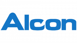
The Alcon logotype is featured in a title case and is written using a stylised and bold sans-serif typeface. Depicted in a light blue colour against a white background, the letter “C” differed from the rest. The ends of the letter “C” were curved inwards and depicted sharp corners. The stretched font evoked a sense of stability and confidence. The light blue colour of the wordmark represented freshness and cleanliness, qualities that are associated with an eye care company.
(2019 – Present)
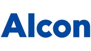
The current Alcon logo displays the brand name in a modern sans-serif typeface. Designed in blue and white, the letters “c” and “o” of the wordmark are round and resemble eyes or lenses. The minimalist and rounded logo symbolises eye care.
The Elements of the Alcon Logo
Font
The wordmark in the Alcon logo is written using a geometric sans-serif typeface. The similar fonts include Volte Bold, Punkto Extra Bold, and URW Geometric Black.
Colour
The Alcon logo is designed in blue against a white background. Here, blue represents trust, professionalism and clarity, the qualities associated with eye care and overall healthcare. The white background provides sharp contrast to the logo.
Finally
The evolution of the Alcon logo reflects the journey undertaken by the company from a small ophthalmic pharmacy founded in 1945 to a global leader in eye care. Although the logo has seen just one change since the company took root, it embodies its commitment to innovation, quality, and service. Besides, it represents the cutting-edge solutions developed by the company in both surgical and vision care segments.