Alcatel is a renowned Nokia-owned telecom brand that began its journey in 2005 in France. As a prominent player in the telecommunications industry, it boasts a rich history spanning several decades. Over the years, the company has undergone significant transformations, which reflect its evolving business strategies and position in the market. And one of the most visible representations of this evolution has been its logo, which has undergone several iterations since its inception. In this article, we take a closer look at the history and evolution of the Alcatel logo. We explore the design elements and the strategic thinking that are behind each change.
The Genesis of the Alcatel Logo (1996 – 2004)
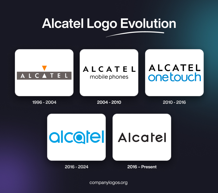
In 1996, Alcatel unveiled its first corporate logo, a step that marked a significant milestone in the branding efforts of the company. The logo featured a dark grey stretched horizontal rectangle, with the word “Alcatel” written inside in white and in a sans-serif typeface. Interestingly, the middle letter “A” appeared as a solid white-coloured triangle with a mirror-like orange-coloured inverted triangle placed just above it. These two triangles were the only graphic elements in an otherwise text-based emblem.
The choice of a dark grey colour palette was deliberate, for it conveyed a sense of sophistication, reliability, and expertise. These are the qualities for which Alcatel products and services are known in the market. Further, the clean, minimalist design of the logo reflected the company’s focus on cutting-edge technology and its desire to project a modern, sleek image.

(2004 – 2010)
In the early 2000s, Alcatel recognised the growing importance of mobile technology and the need to adapt its branding strategy accordingly. As a result, in 2004, the company introduced a subtle yet significant change to its logo. It was the addition of the word “mobile phones” below the main wordmark, “Alcatel.”
This modification signalled the shift of Alcatel towards the mobile communications market. It reflected the commitment of the company to staying ahead of industry trends and anticipating consumer demands. By including the word “mobile phones” in its logo, Alcatel looked to establish a strong association between its brand and the growing mobile technology sector.
Although the overall design elements remained largely unchanged, the addition of the words “mobile phones” marked a key moment in Alcatel’s brand evolution. It set the stage for further evolution as the company continued to navigate the rapidly changing telecommunications landscape.

(2010 – 2016)
In 2010, Alcatel redesigned its logo yet again and added the words “one touch” to it. It became a key component of the company’s brand identity as the label changed to Alcatel One Touch. This change aligned with the company’s focus on delivering intuitive, user-friendly mobile devices and services that could be accessed with a single touch.
The “one touch” tagline was strategically placed below the “Alcatel” wordmark in a light blue colour. The word Alcatel was written in a custom uppercase, sans-serif typeface in black. It underscored the commitment of the company to simplicity, accessibility, and a seamless user experience. This branding shift was made by the company in its effort to streamline user interactions and enhance overall convenience.
The company included the “one touch” tagline in its logo to differentiate itself from competitors. Besides, it wanted to establish a unique brand identity that was centred around user-friendly technology. This move showed the evolving product portfolio of the company and demonstrated its ability to adapt to changing consumer preferences and market demands.

(2016 – 2024)
In 2016, Alcatel went for a comprehensive rebranding exercise. It unveiled a completely overhauled logo that was significantly different from its previous iterations. The new logo featured a vibrant blue-coloured, sleek, and modern design with lowercase letters in a bold, sans-serif font.
One of the most distinctive elements of this new logo was the unique representation of the second “a” in the brand name. It was made to resemble a stylized speech bubble or a smartphone screen. This design choice was related to Alcatel’s focus on mobile communications and its adherence to delivering innovative, cutting-edge products and services.
The vibrant blue colour palette for the logo was carefully chosen to convey a sense of trust, reliability, and modernity. It aligned with the brand values of Alcatel and placed it as a forward-thinking, technology-driven company. The clean, minimalist design of the new logo reflected the company’s emphasis on simplicity and user-friendliness. At the same time, the lowercase letters of the wordmark gave a more approachable and contemporary feel to the brand.

(2016 – Present)
The latest Alcatel logo shows the brand name in black lowercase letters using a bold sans-serif typeface. The wordmark is slightly lesser in size than its previous iteration and the letter “e” has a diagonal arm. Further, the top of the letters “l,” “t,” and “l” is not flat but slightly bulged. The overall logo design exudes a sense of approachability and innovation.

The Elements of the Alcatel Logo
Font
The Alcatel logo features a friendly lowercase wordmark of the brand name, represented by a bold, sans-serif typeface. It has full, rounded letter forms and clean contours. The font used is somewhat similar to Circa Bold or Vilane Regular, but with slight modifications. It gives the contours of the character a more minimalistic appearance.
Colour
The colour palette of Alcatel’s visual identity is a light and bright shade of blue. The colour blue evokes feelings of trustworthiness, reliability, and protection. Furthermore, the blue colour appears highly professional and progressive and reflects the core values of innovation and forward-thinking.
Finally
The Alcatel logo evolution over the years is a visual testament to the adaptability, resilience, and commitment of the company to staying relevant in an ever-changing market. In fact, Alcatel has consistently embraced change and adapted its branding strategy to reflect its evolving business objectives and market position. Today, the Alcatel brand remains a prominent player in the telecommunications industry. It is recognised for its innovative spirit and its ability to deliver cutting-edge products and services.