Skip to content
Home » Famous logos » The History and Evolution of the Akrapovič Logo

The History and Evolution of the Akrapovič Logo

Akrapovič Logo Evolution

The renowned Slovenian company Akrapovič is a manufacturer of high-performance exhaust systems for automobiles. The products of the company are known for their superior quality and advanced technology in the automobile and motorcycle industries. Since the founding of the company in 1991, its logo has grown in parallel to the growth of the company. This article explores the history and evolution of the Akrapovič logo over the years. It traces its journey from a simple design to the powerful brand symbol it has become today, among other details of the company.

The Genesis of the Akrapovič Logo (1990 – 1999)

The initial logo was relatively simple and featured the name of the company, “Akrapovič,” in a slanted and basic sans-serif font. Also, the bold letters in black had a dot symbol on top of the letter “C.”

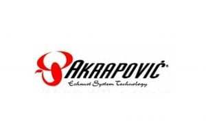
The colour scheme used in the logo included black or white, depending on the background. Also, the logo incorporated a stylized symbol of a scorpion in red, which was inspired by the astrological sign of Igor Akrapovič, the Scorpio. Alternatively, the addition of the Scorpio symbol to the left of the company name was a nod to the original name of the company. This new design conveyed a sense of strength and aggression and was aligned with the high-performance nature of Akrapovič products.

The original logo also featured the small-sized wordmark “Exhaust System Technology” in a cursive style beneath the name of the company. This straightforward design reflected the focus of the company on function over form in its early years.

Akrapovič Logo (1990 - 1999)

(2000 – 2007)

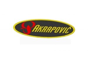
In 2000, although the colour of the scorpion symbol remained red, the wordmark “Akrapovič” in bold italics appeared in yellow. Both the red scorpion symbol and the wordmark in black italics were enclosed within an ellipse with a yellow outline.

Akrapovič Logo (2000 - 2007)

(2007 – Present)

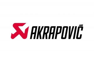
In 2007, Akrapovič unveiled a completely redesigned logo that remains in use today. This modern iteration features a highly stylized scorpion that looks like a wrench. The company name is presented in a custom, bold typeface that exudes strength and precision. The primary colours are black and white, with red being used for the stylized symbol of the scorpion.

Akrapovič Logo (2007 - Present)

The Elements of the Akrapovič Logo

Font

The logo features the brand name “Akrapovič” in an elongated and slanted form. The skewed strokes that are used to execute the letters of the wordmark are similar to the “Kenyan Coffee Italic” font crafted by Typodermic fonts.

Symbol

The logo displayed a stylized symbol of a scorpion in red. Interestingly, the scorpion symbol appears like a wrench, which is a reference to the original name “Skorpion.” Also, there is a subtle accent over the letter “C” of the wordmark “Akrapovič.”

Colour

The colour scheme of the Akrapovič logo comprises three colours: red, black, and white. The red colour is used to execute the stylised scorpion symbol on the left side of the wordmark in black. And when it comes to the logo being displayed on the racing sticker, the scorpion symbol and the wordmark are displayed in white against a black background.

The History of Akrapovič

Akrapovič happens to be a renowned Slovenian company that has revolutionised the exhaust system industry with its superior quality and innovative technology. No wonder; it has earned the trust of motorcyclists and car enthusiasts the world over. Founded in 1991 by Igor Akrapovič, a former motorcycle racer, the company came into existence after recognising the market’s need for high-quality exhaust systems. This vision led to significant advancements in the automobile and motorcycle industries, especially when it came to their exhaust systems.

The initial exhaust systems developed by Akrapovič made a substantial impact on motorcycle racing. Soon, it gained a stellar reputation for its quality and inventiveness, and it was adopted by leading racing teams globally. A key moment for Akrapovič came in 1997, when it introduced the industry’s first all-titanium exhaust system. The immediate success of this groundbreaking product cemented the status of Akrapovič as a leader in the exhaust market for motorcycles.

Since then, Akrapovič has continued to excel by providing top-quality exhaust systems for prestigious brands such as Ferrari, Lamborghini, Porsche, and Audi. Known for their quality and reliability, these products enhance vehicle performance substantially for drivers around the world. It goes without saying that Akrapovič’s history of innovation shows its dedication to research and development. For instance, the patented “Megaphone” muffler design is a notable example of the commitment of the company to maintain its leadership position in the industry.

The superior-quality exhaust systems manufactured by Akrapovič are globally recognised for their exceptional performance, appealing sound, and remarkable durability. They remain a favourite among motorcycle racers and car enthusiasts around the world.

Interesting Facts About Akrapovic

  • Akrapovič was founded in 1991 by Igor Akrapovič, who was a Slovenian motorcycle racer. He wanted to build better-performing exhaust systems for his own bikes after being dissatisfied with the existing options.
  • The company started by making exhausts for racing motorcycles and quickly gained fame in professional motorsports. Akrapovič exhausts have powered numerous world champions in MotoGP, World Superbike (WSBK), and other racing series.
  • Akrapovič is one of the first companies to use titanium and carbon fiber extensively in exhaust production. These provided their systems with exceptional lightness, strength, and heat resistance.
  • Unlike many competitors, Akrapovič produces almost every component in-house. These included the titanium alloys they use, which are crafted in their own metallurgical lab for precise quality control.
  • The brand is known for its distinctive deep and refined exhaust tone, which is engineered not just for performance but also for acoustics. It is a key reason for the car and bike enthusiasts to love it.
  • While Akrapovič started with motorcycles, it later expanded into high-performance car exhausts. It supplied for brands such as Porsche, BMW, Audi, Lamborghini, and Aston Martin.
  • Many major manufacturers install Akrapovič systems as official performance parts or factory options. These showcased the brand’s credibility in high-end automotive engineering.
  • The company has received numerous Red Dot Design Awards and iF Design Awards for its innovative exhaust shapes, materials, and finishes.
  • Akrapovič emphasizes sustainable production by using clean energy, recycling titanium scraps, and minimizing waste in their manufacturing process.
  • The research center of the company in Slovenia features state-of-the-art dynos, 3D scanning, fluid dynamics simulations, and acoustic chambers. These contribute to world-class performance tuning.
  • The bold red “A” logo with a stylized exhaust curve symbolizes precision, speed, and power. The logo makes it instantly recognizable in both motorsport and street performance circles.
  • Akrapovič is one of Slovenia’s most successful global brands, and represents innovation and engineering excellence on an international scale.

Finally

The evolution of the Akrapovič logo shows the journey of the company from a small Slovenian startup to a global leader in exhaust system technology. Each iteration of the logo has reflected the growth, values, and positioning of the company in the market. The logo captures the adherence of the brand to performance, innovation, and precision engineering. With Akrapovič continuing to push the boundaries of exhaust system design, its logo stands as a testament to its past achievements and future ambitions.

Leave a Reply

Your email address will not be published. Required fields are marked *