AKG Acoustics, commonly known as AKG, is a renowned Austrian audio engineering company known for its groundbreaking innovations in sound technology. It was founded in 1947 in Vienna by Dr Rudolf Görike and Ernst Pless and quickly rose to prominence as a pioneer in professional audio equipment.
It is known for designing some of the world’s most influential microphones, headphones, and wireless systems. The AKG logo has evolved alongside the expansion of the company and symbolises innovation, precision engineering, and trust. The article delves into the various logos designed by the company, among other details.
The Genesis of the AKG Logo (1947 – Present)
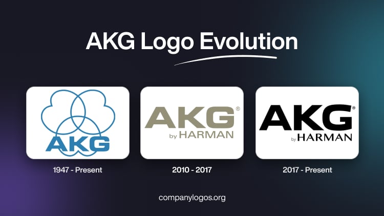
The original AKG logo that continues to date features a graphical emblem and the abbreviated wordmark “AKG” in blue. The emblem includes three geometric figures similar to flower petals. Curved inward, these figures crisscross each other and project a small indentation to their outer ends. The bottom of the emblem shows the uppercase wordmark “AKG” in a bold and geometric sans-serif typeface.

(2010 – 2017)
The logo iteration of 2010 did not have any graphical emblem but only the brand name in ochre colour. The minimalist wordmark in uppercase retained the style of the previous logo and carried the words “by HARMAN” as a tagline below. Written in thin letters, the tagline was positioned to the right. Both the wordmarks were written using a sans-serif typeface.

(2017 – Present)
Although the AKG logo is similar to the previous iteration in terms of design, the font, colour, and style have been changed. The wordmarks (including the tagline “by HARMAN”) are written in monochrome using a classic sans-serif typeface, which is similar to the Eurostile LT Pro Bold Extended font.
The font is characterised by its clean and sharp lines. The letters of the tagline show legs of varying thickness, and the crossbar of the letter “A” is open. The colour black makes the logo appear masculine, powerful, and laconic.

The Elements of the AKG Logo
Font
The AKG logotype in uppercase is written using a custom, geometric, and modern sans-serif typeface, where the letter “G” is shown with a slightly modernised contour. The similar font is Eurostile LT Pro Bold Extended.
Colour
The AKG logo is designed using a monochrome colour palette of black and white for easy legibility. The colour palette is confident, timeless, and powerful.
Finally
The evolution of the AKG logo reflects the enduring commitment of the company to precision, innovation, and the art of sound. So, what began in post-war Vienna with a simple typographic mark developed into a visual identity that symbolises its core expertise in acoustic engineering.
The introduction of the three-lobed emblem, which was inspired by microphone polar patterns, transformed the logo into a meaningful representation of AKG’s technical excellence and innovation. The AKG logo remains a timeless emblem of sound innovation. It embodies more than 75 years of craftsmanship, engineering excellence, and trust among audio professionals and music lovers worldwide.