Skip to content
Home » Famous logos » The History and Evolution of the Aisin Logo

The History and Evolution of the Aisin Logo

The premier Japanese brand Aisin is a producer and supplier of high-quality accessories or spare parts for the Japanese, Korean, and American automobile manufacturers. The accessories manufactured by the company include sensors, brake systems, transmissions, navigation systems, steering components, and parking assistance systems, among others. Besides, the brand also manufactures a range of components for the automobile ancillary industry, such as clutch and brake system components (pads, cylinders, and disks), water and oil pumps, and transmission fluids.

As a premier automotive parts supplier with a rich heritage, Aisin has relied on a simple yet powerful logo to represent its brand identity. The logo represents the ideas, hopes, and determination of the company to realise its philosophy—inspiring movement, creating tomorrow. This article delves into the history and evolution of the Aisin logo, among other details of the company.

The Genesis of the Aisin Logo (???? – Today)

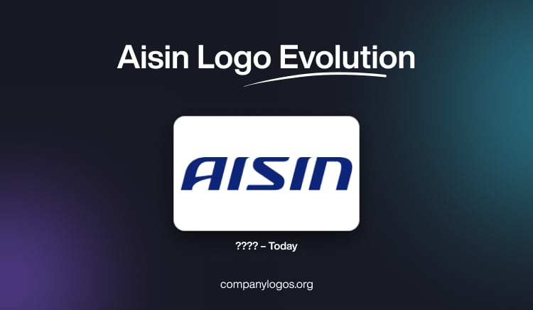
There seems to be a lack of publicly available information regarding a specific date when the Aisin wordmark logo was introduced. However, the present design has become synonymous with the company and remains in use to this day. It comprises a wordmark design that features the name of the company in both uppercase and lowercase.

Interestingly, the letters “A,” “S,” and “I” are in uppercase, while the last letter “n” is in lowercase. The most striking aspect of the logo is the use of a deep shade of blue set against a white background. The colour palette symbolises trust, reliability, and excellence, qualities that Aisin strives to embody in its products. 

The entire wordmark is slanted slightly to the right and conveys a sense of motion and forward momentum. The italicised text conveys the drive and energy of the employees who work in unison to achieve their dreams and aspirations and build a new future.

This design choice aligns perfectly with the philosophy of the company: “Inspiring movement, creating tomorrow.” The two “I”s in the AISIN wordmark feature stretched tops with a sharp curve to the right. Besides, the rounded contours at the top of the wordmark “AISIN” symbolise unity and togetherness.

Aisin Logo (???? – Today)

The Elements of the Aisin Logo

Font

The italicised uppercase letters of the Aisin logo feature a custom bold typeface with futuristic character shapes. Moreover, the unique details on the capital “I”s and the diagonal bar of the “A” give the wordmark a distinctive and classy appearance. At the same time, the lowercase “n” adds a touch of friendliness and accessibility.

Colour

The colour palette of the Aisin logo is centred around a deep and smooth shade of blue. The shade symbolises excellence, innovation, and high quality. Set against a white background, the blue colour also conveys trustworthiness and stability.

The History of Aisin

The history of Aisin dates back to 1943, when the company started manufacturing aircraft engines under the name Tokai Kogu Kogyo, or later Tokai Hikoki. Initially, the company focused on this niche market and later expanded its production line in 1945 to include car parts and sewing machines as well. This diversification positively impacted the economy of the company and enabled it to become a leading player in the manufacture of automobile parts in Japan. 

In 1965, Tokai Hikoki merged with Shinkawa Kogyo to form Aisin Seiki Co., Ltd. This merger led to the expansion of the network of overseas representative offices of the company and boosted the popularity of the brand among customers. Soon, the high-quality automobile components produced by Aisin made it a top supplier of spare parts for Japanese, Korean, and American automobile brands as well. 

Today, the automotive components produced by Aisin have become essential for nearly all leading automakers in the world. The product lineup of the company includes automatic transmissions, clutch components such as baskets, release bearings, and disks, and even automatic transmission fluids. 

The Aisin brand is also recognised as ASCO, with original spare parts easily identifiable by their branded packaging and special stickers on the products. Thus, the high quality of products, even if they happen to be the smallest parts of an automobile, makes Aisin what it is today. Today, though Aisin is part of the Toyota Group, it operates independently. However, given that a significant portion of Aisin’s capital comes from Toyota, one can view Aisin as dependent on the Japanese automobile behemoth. 

Interestingly, the flexible policy of Toyota allows Aisin to supply spare parts to its competitors as well. This approach has proven to have a significant positive economic impact on Aisin as well as its parent company, Toyota.

Interesting Facts About Aisin

  • Aisin is consistently ranked among the Top 10 global Tier One automotive suppliers. It services both OEM and aftermarket customers worldwide.
  • The company is a member of the Toyota Group, which makes it a key supplier to Toyota as well as other major automakers.
  • Aisin traces its roots to 1943, when it manufactured aircraft engines as Tokai Aviation Industries during the Second World War.
  • The modern company was formed in 1965 through the merger of Aichi Kogyo and Shinkawa Kogyo. It later adopted the name Aisin Corporation in 2021 after merging with Aisin AW.
  • Aisin has a legacy of achieving several technological firsts, which include:
    • The world’s first voice navigation system (1992)
    • The first parking assist system (1999)
    • The first Intelligent Parking Assist (2003)
    • The first rear-wheel drive hybrid transmission (2006)
    • The first high-torque capacity front-wheel drive 8-speed automatic transmission (2006)
    • The first rear-wheel drive 10-speed automatic transmission (2017).
  • Beyond automotive components like transmissions, brakes, and body systems, Aisin also manufactures lifestyle and energy products such as beds, sewing machines, cogeneration systems, and audio equipment.
  • The company has also supplied wellness-related products and even produced mattresses until 2020.
  • Aisin operates 207 consolidated subsidiaries and employs approximately 120,000 people worldwide. It has manufacturing bases in Japan, North America, Europe, China, ASEAN, and India.
  • Its products are available in over 100 countries, and are supported by a vast global network.
  • Aisin is actively involved in developing technologies for vehicle electrification and carbon neutrality. It aims to support a cleaner and more efficient mobility future.
  • The company invests heavily in R&D and focuses on safety, comfort, and convenience. These include in-cabin monitoring and child presence detection systems.
  • Aisin has received prestigious accolades, including the Deming Prize, which recognizes excellence in quality management.
  • The company’s headquarters is located in Aichi, Japan, and features expansive office and manufacturing complexes.
  • Aisin branding has appeared on championship-winning vehicles, such as Brett Moffitt’s 2018 NASCAR Camping World Truck Series champion Toyota Tundra.
  • Aisin’s guiding philosophy is “Inspiring movement, creating tomorrow,” which emphasises its mission to contribute to a better society through innovation and manufacturing excellence.

Finally

The Aisin logo shows the dedication of the company to quality, inspiration, and progress. The Aisin logotype has stood the test of time and continues to effectively represent a brand that has become synonymous with excellence in the automotive world. And given the flexibility shown by its parent company, Toyota, the logo is likely to adapt in the future based on the trends and market dynamics of the future.

Leave a Reply

Your email address will not be published. Required fields are marked *