In the world of sports and athletic footwear, few symbols carry as much cultural significance as the iconic Air Jordan logo. The emblem has become synonymous with basketball legend Michael Jordan. The logo has become a symbol of excellence, athleticism, and a cultural phenomenon. The logo stands out as one of the most recognised symbols worldwide, particularly within the athletic footwear industry. It represents Michael Jordan’s passion, aspirations, and accomplishments.
Essentially, the logo is a stylised portrayal of the athlete in mid-jump. With legs elegantly spread and the ball held in his left hand mid-flight, the logo captures the essence of Jordan poised for a slam dunk. This article explores the rich history and evolution of the Air Jordan logo, among other details of the brand.
The Genesis of the Air Jordan Logo (1984 – Present)
The early Air Jordan logo that featured on the inaugural Air Jordan 1 was a simple yet powerful design. It was created by graphic designer Peter Moore and depicted a basketball with wings. The design symbolised the unparalleled flight and grace of Michael Jordan on the court. The iconic “Air Jordan” inscription in uppercase stood at the top of the logo in a wavy formation.

(1988 – Present)
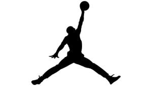
In 1988, the Air Jordan brand took a giant leap forward with the introduction of the Jumpman logo. It was created by Nike’s legendary designer, Tinker Hatfield, where the Jumpman logo replaced the original winged basketball design. This move proved to be a stroke of genius, as the Jumpman logo captured the essence of Michael Jordan’s gravity-defying dunks and became an enduring symbol of basketball excellence.
The Jumpman logo featured a silhouette of Michael Jordan mid-flight with legs spread apart and one arm reaching for a slam dunk. The dynamic and energetic design perfectly encapsulated Jordan’s athleticism and provided a timeless image that would go on to define the Air Jordan brand for decades to come.
The Elements of the Air Jordan Logo
Symbol
The iconic Jordan logo, aka Jumpman, shows the dynamic pose of the airborne figure. This pose stands out as one of the most captivating design elements in the emblem. It vividly portrays Michael Jordan in the midst of athletic action. The stylised posture made its debut in a US Olympic outfit prior to the 1984 Olympic Games and reappeared in 1985. It featured Jordan in a similar stance and was emblazoned across the Chicago Bulls outfit and Nike sneakers.
Besides, the elongated legs in the emblem contribute to the overall balance of the airborne figure. When viewed upside down, they mirror the shape of the letter “V”. As the 22nd letter of the English alphabet, “V” symbolically reflects Michael Jordan’s career progression. Jordan embodied traits associated with the letter. These include being valuable, versatile, and consistently striving for victory.
Font
The original logo designed by Peter Moore displayed the wordmark in tiny serifs and curves. However, the latest logo does not have the graceful serifs. Besides, the glyphs give a sporty feel and look simpler.
Colour
The Air Jordan (Jumpman) logo is designed in a monochrome colour palette where the black silhouette of Michael Jordan and the wordmark beneath are set against a white background.
Finally
The Air Jordan Jumpman logo is a testament to the enduring power of sports, innovation, and individual excellence. It continues to push boundaries and redefine athletic and cultural norms. Needless to say, the logo will forever be associated with the spirit of flight, excellence, and the indomitable legacy of Michael Jordan.