The former president of Ecuador once said, “Pilots are a rare kind of human. They leave the ordinary surface of the world to purify their soul in the sky, and they come down to earth only after receiving the communion of the infinite.”
One such aviator was visionary J.R.D. Tata. The first licensed pilot in India, who paved the runway for Air India.
This article recounts the events in the history of the Air India logo, from its nationalization to its subsequent return to the Tata Group.
1932 – 1938: Tata Air Services
On 15th October 1932, J.R.D. Tata founded Tata Air Services. I know, not the name you’re anticipating. But during its initial years, it was an air-mail service that ran a round-trip from Karachi to Mumbai.
Although the company did not have a formal logo at that time, it had some visibility and representation with its annexures, like baggage labels, promotional pamphlets, etc.
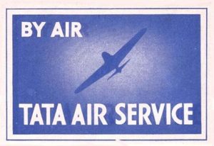
This 1932 label was a rectangular marker, displaying a faint imagery of an aircraft. The flying fleet tilted slightly towards the inscription “by air,” which was at the top left corner of the label.
Beneath all this, the company’s name, ‘Tata Air Service’, featured prominently from end to end. The font type used was bold and quite crisp and retro-styled. The use of different hues of indigo gave a certain depth to the label, whereas words were in clean white.
1938 – 1946: The First Official Logo of Tata Airlines
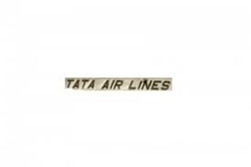
A few years later, the airline started operating domestic flights, leading to its rebranding as Tata Airlines in 1938. This namesake turned out to be the very first logo of Air India.
We didn’t see much experimentation in the airline’s genesis logo. The lettering “Tata Air Lines” was written in simple, sleek, italicized capital letters. The color palette followed for the text was pretty simple. A solid black gradient text against a white setting was minimalistic but was doing its job.
1946 – 2007: Leaping Centaur Symbol
As it transitioned into a public limited company on 29th July 1946, it also continued its commercial services under a new name, the name that we all know today – Air India.
As a result, the company revealed the new logo shortly before India’s Independence. This Air India emblem included a centaur, a mythical half-man, half-horse creature, jumping over a circle and shooting its arrow.
Fascinatingly, this almost circular shape was inspired by the distinctive wheel structure of the famous Sun Temple in Konark, Odisha.

The name ‘Air India’ was visible under the icon in bold, italicized, customized sans typeface. J.R.D. Tata himself selected the color scheme for the logo which was bright red on a white background.
1948 – 1960: Air India Logo for International Identity
After taking a 49% stake in the airline post-independence, the Indian government began using it for international flights under ‘Air India International’.
Thus, Air India launched a secondary logo for its international operations. The design of this Air India logo was quite simplistic. It followed a similar color palette of red and white, except for a darker gradient of red.
The company name was also written in the same all-caps, italic font type, but with the addition of a hyphen between Air and India. The lettering ‘International’ beneath seemed to be penned and was in lowercase.

1960 – 1970: An Indigenous Insignia
Following this, the secondary Air India logo underwent further refinement, with the ‘International’ wordmark replaced by the Air India script in Hindi in inky-black color.
Similar to English lettering, the hyphen was also present in the Hindi inscription. The addition of the Hindi inscription united Air India’s two personas, Domestic and International – a decision that shaped the brand’s logo for years.

1971 – 1972: Air India Logo That Had It All
This was the time period when Air India was transforming air travel in India. Jets replaced the propeller planes. And with the very first Air India jet, the airline introduced the “Palace in the Sky” livery and branding.
For this rebrand, the Air India symbol featured a centaur crest, the airline’s name written bilingually, and a familiar color palette of red on white – all of which were reminiscent of the previous iterations.

However, the placement of text was different. The Hindi typography was superseding the English one in this version. The font was a slightly bold sans typeface and was in uppercase.
In comparison with the previous centaur crest of 1946, this one was more refined and structured. The circle encapsulating the beast was also complete.
1972 – 1989: The Elevating Logo
At this point, the airline slightly refreshed its 1971 logo, embracing its ‘palace in the sky’ representation. In this logo, the Hindi and English typography were placed on the left and the right side of the emblem, respectively. The logo size was thus adjusted to align with the wordmark.
Although this version of the logo featured a maroonish-red gradient, the font style was similar to that of the 1971 version. Apart from repositioning of the logo and wordmark, and the use of strikingly similar color choice, the refreshed logo offers very little that was truly new.
1990 – 1991: Parallelogram in The Sky
In the ‘90s, the airline tried to reintroduce itself with a fresh logo, blending both traditional and modern elements.
Therefore, the icon consisted of a bright red parallelogram, encasing a golden-bronze sun that had 24 spokes. This sun was framed in a similar color ring. The font type used was also fresh compared to earlier ones. The typography followed was a customized sans-serif font for English and a modified Devanagari font for Hindi text.
Sadly, this Landor Associates-designed Air India logo didn’t receive much public appreciation, and the airline went back to the 1972 design, which remained the face of Air India till 2007.
2007 – 2023: The Logo of Union
In 2007, Air India merged with Indian Airlines. The consolidated airline was renamed National Aviation Company of India Limited (NACIL), but later changed to ‘Air India Limited’. This union created an entirely different purpose and identity. Thus, Air India decided to unveil a new logo that was a blend of both airlines’ previous designs.
The logo looked like an artsy red flying swan. The emblem displayed a symmetrical pattern known as the Konark wheel at its center.
The typical typography in both languages was also present in the logo, except for the hyphen mark, which was dropped from both language engraving.
In 2014, Air India became a member of the elite ‘Star Alliance’, the world’s first and largest airline group. To mark this milestone, the airline revealed the same logo with the addition of the line ‘A Star Alliance member,’ along with the alliance’s logo on the right.

2023 – Present: A Window To The Future
After the Tata Group reacquired Air India, it rebranded the airline in August 2023 with an enigmatic makeover. The new Air India logo, ‘The Vista,’ blends heritage and modernity. Vista is a golden window frame that offers a view of limitless possibilities and progressiveness.
This bold and eccentric logo comes with other upscaling, like the total change of the previous color palette to a fresh and unique one that consists of deep red and gold highlights.
To mark its revival, Air India introduced a secondary logo with a background that transitions from deep red to aubergine. The new typography, famously called “Air India Sans,” is in white, with a golden Vista added in the top-right corner.

Finally
The logo history of Air India spotlights its journey from its lift-off in 1932 to the turbulent times of privatization to the stable skies of reacquisition. Throughout these times, the ample variations of the Air India logo hide some meaning.
For example, the old Air India logo showcases the ambition of a visionary aviator when it was just Tata Air Lines. Whereas the new Air India logo of 2023 represents the brand’s established progressive approach.
The evolution of the Air India logo defines its journey through various ups and downs and tells the real story of Air India.
FAQs
1. What made Air India change its logo?
After the re-acquisition of Air India by the Tata Group in 2022, a whole new identity of Air India was launched in August 2023. It also included a changed logo known as ‘The Vista’, symbolizing its unlimited possibilities and a progressive perspective.
2. Who made the Air India logo?
The original centaur crest was chosen by J.R.D.Tata himself. The parallelogram logo was designed by Landor Associates. The swan logo, on the other hand, was the amalgamation of Air India and Indian Airlines. Tasneem Ali designed the most recent ‘The Vista’ logo.
3. What is the Air India logo?
The recent Air India logo is known as ‘The Vista’. The logo was inspired by the window detailing of the plain livery or by the peak of the golden window frame.
4. Why did Air India rebrand itself?
Air India rebranded itself to proclaim the airline’s ownership, to represent India’s cultural identity, and to compete globally.