Adobe Inc. is a renowned name in the world of digital creativity and publishing, which is known for its transformative software and technological innovations, such as Photoshop, Flash, Illustrator, Dreamweaver, and others. It started its journey as a Silicon Valley startup and has transformed into a global leader in creative tools. Its success is underpinned by great products, strategic decisions, and an enduring influence on how people create and share digital content.
The Adobe logo has undergone a remarkable transformation since the company’s founding in 1982. Each logo redesign reflects shifts in Adobe’s identity, technological innovation, and its expanding influence in the creative industry. The article delves into the evolution of the Adobe logo and the logos of some of its marquee software products, among other details.
The Genesis of the Adobe Logo (1982 – 1990)
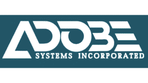
The first Adobe logo was designed by Marva Warnock, wife of co-founder John Warnock. It featured the company name in white, set against a deep teal blue background. The company name was rendered with a custom geometric, modern typography. Here, the capital “A” resembled a triangle with an open base, and the letter “E” was formed of three horizontal bars with diagonal cuts at the ends. Also, beneath the brand name appeared the tagline “Systems Incorporated” in a small Friz Quadrata serif font in uppercase.
(1990 – 1993)
In the early 1990s, Adobe simplified its logo and switched to a black-and-white colour scheme. The brand name was written using a bold, sans-serif font with stylised letters, mostly displayed in a geometric pattern. All other elements were removed to reflect a modern, efficient, and adaptable identity as the company’s software portfolio grew.

(1993 – 2014) (Primary); (2014 – 2017) (Secondary)
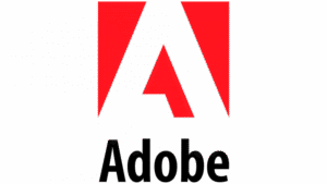
The year 1993 marked a key change to the logo. It brought the stylised letter “A” to the forefront, set in white and placed within a bold red square. This “A” was inspired by the shape of Adobe Creek, which ran behind the Warnock home. The wordmark “Adobe” below appeared in black beneath the emblem, using a clean, Myriad Pro Semibold Condensed font. The red square symbolised energy, passion, and innovation, and the simplicity of the logo made it highly recognisable across print and digital media.
(2014 – 2020)
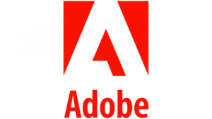
The 2014 logo iteration became more refined, wherein the “A” emblem got more seamlessly integrated with the wordmark. Placed to the right or bottom of the emblem, the more stylish and bold wordmark was rendered in an Adobe Clean Bold Condensed typeface. The letters “d” and “b” of the wordmark looked like mirror images of each other.

(2020 – Present)
Designed by The Acid House, the logo of 2020 saw its colour palette changed from black to red, and the red became brighter. The rest of the logo elements more or less remained the same, with the lines of the letters getting bolder. The typeface chosen for the wordmark remained the same – Adobe Clean Bold Condensed.
(2022 – Present) (Socials); (2024 – Present) (General)
Designed by Mother Design’s in-house team, the 2022 logo variant saw the iconic “A” emblem removed. However, the first letter “A” of the wordmark is replaced with a solid triangular symbol. This resulted in the logo becoming bolder and more modern in appearance. Interestingly, the crossbar in the letter “A” is shifted to the bottom but kept open-ended. This way, the logo subtly takes reference from the original design by Marva Warnock as a nod to Adobe’s heritage. The vibrant red colour of the logo reinforces brand recognition while balancing distinctiveness and legacy.

The Elements of the Adobe Logo
Font
The wordmark used in the Adobe logo is rendered using a modern and stylish sans-serif typeface. The contours of the letters “d” and “b” were interesting and looked like mirror images of each other. Some of the fonts similar to this are FF Pastoral Bold and Diodrum SemiBold.
Colour
The colour palette of the Adobe logo consists of red, white, and black (wordmark) to convey confidence, development, and power.
Finally
The evolution of the Adobe logo is a visual narrative of the company’s journey of becoming a global software powerhouse. It is rooted in technical precision, driven by creative empowerment, and is ever-adaptive to the changing landscape of design and technology.