AData Technology Co., Ltd. is a Taiwan-based multinational company that specialises in the design and manufacture of high-performance memory storage products and Apple accessories. Founded in 2001, AData has established itself as a prominent brand in the consumer electronics market and manufactures hard drives, DRAM modules, various types of media for digital storage, and solid-state drives, among others.
Over the years, the visual identity of the company has changed just once, which reflects its dedication to progress and the desire to stay ahead of the competition. This article explores the journey of the evolution of the AData logo since its inception, among other details of the company.
The Genesis of the AData Logo (2001 – 2010)
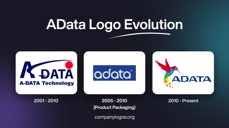
In its formative years, the AData logo was a simple yet striking emblem that represented the vision and aspirations of the company. The original design featured two dark blue wordmarks at two levels. The top level featured the wordmark “ADATA,” where the first letter “A” appeared in an enlarged form and a little away from the rest of the wordmark.
Interestingly, the letter “A” did not have any central crossbar but an extended arch to the right and all the way to the last letter. The other half of the wordmark “ADATA” had an unusual-looking D with a short stripe across its vertical part. Also, a bright red circle sat atop the last letter “A.” At the level below, the brand name “A-DATA Technology” was mentioned.
The colours and elements chosen by the designers were influenced by the Taiwanese flag. Besides, the solid red circle atop the last letter “A” signified the sun. In a way, the brand name aimed to become the main star in the solar system.
The minimalistic approach taken by the designers aimed to convey a sense of professionalism, modernity, and technological prowess. The clean lines and symmetrical composition shown in the logo reflected the commitment of AData to precision and attention to detail. These are the essential qualities in the fields of memory storage and data management.

(2005 – 2010) (Product Packaging)
In 2005, the product packaging logo featured the brand name in white, without any emblem, in lowercase letters. The rounded letters with pointed serifs were set against a black rectangular background.

(2010 – Present)
In 2010, AData introduced a bold and dynamic new logo that would become an enduring emblem of the company’s commitment to innovation and progress. The redesigned logo prominently featured a stylized graphic of a hovering hummingbird. The hummingbird was chosen of all birds as it represents the agility and speed of the company and its pursuit of advancement. Also, the upward motion of the bird conveys a sense of constant movement.
It symbolises the dedication of AData to rise above industry standards and pushes the boundaries of what is possible. The hummingbird appears in an attractive colour palette comprising shades of red, sky blue, purple, tangerine orange, green, and pineapple yellow. The tail of the hummingbird is followed by a string of five pointed stars in tangerine orange.
Further, the brand name in an azure blue colour is featured on the right of the hummingbird in a typeface that resembles Lucida, a commercial typeface. The significance of hummingbird in the brand narrative of AData extends beyond mere aesthetics. It has become a powerful metaphor for the ethos of the company and embodies the qualities of freedom, exploration, and the relentless pursuit of new horizons. By adopting this symbol, AData signalled its intention to continually challenge conventions, embrace change, and adapt to the rapidly evolving technological landscape.

The Elements of the AData Logo
Symbol
To the left of the wordmark, a hovering hummingbird gives the logo a sense of dynamic movement. It takes flight and leaves behind a trail of irregularly shaped and orange-coloured five-pointed stars in its wake.
Font
The logo of the company boldly displays its name in capital letters. It is rendered in an elegant typeface similar to Lucida. This logo serves as an anchor and symbolises the reliability and technical expertise of the brand.
Colour
The bird’s image is a kaleidoscope of vibrant colours. It seamlessly changes from rich purple to deep red, sky blue, verdant green, warm orange, and a vibrant pineapple yellow.
Finally
The evolution of the AData logo is an interesting story of growth, innovation, and adherence to excellence. The logo of the company, in the form of a hummingbird in action, shows the journey of the company towards continuous improvement and adaptation. The current logo design encapsulates the brand essence of AData and conveys a powerful message of agility, progress, and technological prowess.