Absolut is one of the most iconic vodka brands in the world. Based in Sweden and established in 1879, the brand now belongs to the Pernod Ricard Group. It is known for its bold and minimalist bottle design and advertising campaigns. The identity of Absolut is built around its unique visual presentation in the form of the logo, which has become etched in public memory. The article traces the evolution of the brand and its logo over the years, among other details.
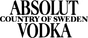
The Genesis of the Absolut Logo (1879 – 1979)
Absolut was initially called “Absolut Rent Brännvin” with a simple label featuring the name in a basic serif font. In the early 20th century, the brand adopted a more classy and ornate Art Nouveau-inspired label design as vodka. The original logo appeared in three levels, wherein “Absolut” came at the top, “Vodka” at the bottom, and “Country of Sweden” placed between them in a smaller size. The three wordmarks in a traditional serif typeface in uppercase were presented in a black-and-white colour scheme.
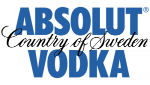
(1979 – 2014)
The logo of this era had the letters “Country of Sweden” written in a graceful black cursive script and inscribed between the blue coloured text “Absolut” and “Vodka” in uppercase. The logo focused on the Swedish heritage of the brand and its specialisation in crafting exceptional vodka.
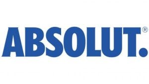
(2014 – Present)
The Absolut logo was revamped in 2014 and a sleeker one was introduced. Adhering to minimalism, the logo was confined to one line in order to shift the focus to the core essence of the brand. The brand name was executed using a vibrant blue colour in a thick typeface inspired by Futura Condensed.
The Elements of the Absolut Logo
Font
The wordmark forming the Absolut logo is written using a thick and bold typeface reminiscent of Futura Condensed. Also, the short width of the letter adds to the vintage appeal of the brand. The large uppercase letters depicting the logo in a single line emphasises on the fact that “less is more”.
Colour
The colour palette of the Absolut logo contains a deep shade of blue, which evokes a feeling of cold, purity, cleanliness, and freshness. The attributes correspond to the main qualities of Absolut vodka.
Finally
The Absolut logo has stood the test of time as a symbol of clarity, simplicity, and modernity, and perfectly reflects the brand’s identity. By embracing clean typography and a minimal design approach, it has maintained a timeless quality. The consistency in logo design has reinforced brand recognition across generations as well as positioned Absolut as an icon in the spirits industry and contemporary culture. So, from a 19th-century label to a 21st-century icon, the Absolut logo has evolved to remain popular yet fresh across the decades. The name and styling capture the Swedish vodka’s mix of tradition and contemporary attitude. These seamlessly blend heritage and modernity.