Anheuser-Busch InBev (AB InBev) is the world’s largest beer company, with a portfolio of over 500 beer brands. These include Budweiser, Stella Artois, and Corona. As a result of several mergers and acquisitions, the AB InBev corporate identity has undergone a few changes. The article delves into the various logo changes over the years.
The Genesis of the AB InBev Logo (2008 – 2016)
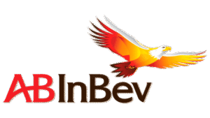
In 2008, InBev acquired Anheuser-Busch, the iconic American brewer known for Budweiser. This $52 billion merger created Anheuser-Busch InBev (AB InBev). The new AB InBev logo introduced in 2008 featured a vibrant and dynamic eagle in flight. It had a blend of red, orange, and yellow colour tones. The wordmark “AB InBev” was written in a refined custom serif font below.
The “AB” part of the brand name was displayed in red, while the rest was brown. There were no gaps between the two parts of the name, but the horizontal bar of the letter “A” arched into the letter “B”.
The eagle, borrowed conceptually from Anheuser-Busch’s heritage, symbolised freedom, global reach, and strength. Further, the gradient colours added energy and movement and reflected the dynamic nature of the newly formed global entity.
(2016 – 2022)
In 2016, SABMiller, the UK-based brewer, became a part of the AB InBev family. The new logo to introduce this change was designed by Ian Brignell for Jones Knowles Ritchie. The new design did not have the hovering eagle, which was mostly associated with the Anheuser-Busch company. However, the wordmark remained mostly unchanged, except the letters became bigger and the colours brighter.

(2022 – Present)
In 2022, AB InBev launched a refreshed visual identity as part of a broader shift toward sustainability, digital transformation, and innovation. It introduced the third player, SABMiller, into the logo in the form of the yellow ball to the left. The ball comprising three petals of different sizes symbolised the three players that formed AB InBev. The wordmark executed in a smooth sans-serif typeface appears in black.

The Elements of the AB InBev Logo
Font
The wordmark that forms part of the AB InBev logo is written using a sleek and bold serif typeface. Its smooth lines and serifs are similar to the Quadrat Serial typeface. Interestingly, the horizontal bar of the letter “A” forms an arc from the left bottom corner to the middle of the letter “B”. This conveys family continuity, as Anheuser’s daughter married Busch, and the company was passed down over generations.
Colour
The AB InBev logo employs a total of five colours – white, yellow, red, brown, and black. The colour white signifies an aspiration to start anew, yellow stands for the joy of life, and red signifies love, energy, resilience, and a desire for change. The colour brown is about experience and stability, while black projects the power and strength of the company.
Finally
The AB InBev logo and its variants show the remarkable journey of the company from regional brewers to a global beverage titan. The expansive span of the logo, be it the rich symbolism of the soaring eagle or the sleek, modern design of today, reflects AB InBev’s strategic priorities and market positioning.