CCTV is arguably the largest state-owned broadcaster in China with a huge viewership. It began as Beijing Television in 1958, before being renamed China Central Television on May 1, 1978. The China Central Television (CCTV) logo has undergone several changes since the inception of the network. These logo iterations show both technological advancements and shifts in China’s media landscape. The article delves into the evolution of the CCTV (China) logo and provides details about other aspects of the company.
The Genesis of the CCTV (China) Logo (1958 – 1964)
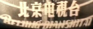
The original logo of CCTV (China) showed the Chinese inscription of Beijing Television, which was founded on 1st May 1958. The Chinese inscription used a custom Song typeface, aka Hanyu Pinyin. The wordmark also mentioned “Beijing Dianshitai” in calligraphy.
(1964 – 1978)
Designed by Mao Zedong, the 1964 logo of Beijing Television was written using Chinese calligraphy.

(1978 – 1982)
On 1st May, 1978, Beijing Television was renamed China Central Television. This momentous occasion was represented by a logo change and designed by Hua Guofeng. It showed the new name in a bold and custom Chinese inscription.

(1979 – 1998)
(1998 – 2002) (Secondary), (2001 – 2013) (Tertiary), and (2009 – Present) (Quaternary)
On New Year’s Day 1979, CCTV introduced what would become its most recognisable logo. It was designed by then-employee Zhang Desheng. This design, often nicknamed the “butterfly” or “atom”, featured a stylised, symmetrical motif that suggested both modernity and connectivity. The logo’s abstract form symbolised the network’s ambition to serve as a central node in China’s rapidly developing broadcast infrastructure.
Designed in a red, green, and blue colour palette, the logo consisted of two overlapping circles placed at an angle to each other. The wordmark “TV” in red appeared at the centre in such a way that the letter “V” followed the path of the two circles.

(1998 – Present)
(1998 – 2001), (2001 – 2013) (Secondary), and (2009 – 2020) (Tertiary)
The 1998 logo iteration was designed by Akira Hasegawa, Tadashi Nakatani, and Tomoki Suzuki of Sun & Moon Inc. Nicknamed “Double-line” by fans, the logo featured the abbreviation “CCTV” in a red, white, and black colour combination and written using custom typography.

(2001 – Present)
In 2001, the “Double-line” logo was tweaked to make it look more attractive using a custom typeface. The typeface was characterised by small-sized and roundish letters.

(2015 – Present) (Secondary)
The 2015 logo was designed by Zhengbang Design, and it featured the abbreviation “CCTV” in black using a custom typeface. There was a small red square at the end of the abbreviation.

The Elements of the CCTV (China) Logo
Font
The wordmark used in the CCTV (China) logo employs a custom, bold, sans-serif typeface. The letters in the wordmark are clean and modern, with a strong geometric quality that conveys authority and professionalism. Also, since the design is unique to CCTV and is not a standard commercial font, it ensures instant recognisability and a sense of exclusivity.
Colour
The CCTV (China) logo features a black and red colour scheme. Here, black is used to depict most of the letters, and the colour symbolises strength, authority, and seriousness. Besides, it aligns with the status of CCTV (China) as China’s national television network.
The red colour, on the other hand, is used in the inner curve of the first letter “C”. Moreover, the colour is deeply associated with China and represents luck, vitality, and national pride. This red accent also adds a dynamic, eye-catching element to the otherwise monochrome design.
Finally
The evolution of the CCTV (China) logo encapsulates the journey of the broadcaster from a domestic, state-run channel to a sophisticated, global oriented media conglomerate. Each logo redesign reflects broader changes in Chinese society, technology, and the global role China seeks to play through its media.