The US-based Ritz-Carlton brand is synonymous with luxury, refinement, and a rich heritage that dates back to César Ritz, the legendary Swiss hotelier who is also known as “the hotelier of kings and the king of hoteliers”. Set up in 1983 in Boston, USA, the brand is known for offering golf courses, spas, luxury meeting and conference spaces, and residences.
Owned by the Marriott International Group, the Ritz-Carlton name has become a global symbol of hospitality excellence. Its famed logo featuring the iconic lion and crown has played a critical role in shaping and reflecting that identity. The article delves into the evolution of the Ritz-Carlton hotel, among other details of the brand.
The Genesis of the Ritz-Carlton Logo (1912 – 1965)
The original logo of Ritz-Carlton is not documented anywhere; it came into existence with the establishment of the hotel chain in the USA.
(1965 – 2015)
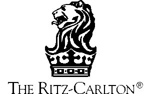
The first known logo of Ritz-Carlton was created by the owners of the Boston property. It featured the now-famous lion and crown emblem to symbolise “elegance, refinement, and noble bearing”. The ornate crown is lined with intricate work and pearls to exude luxury.
In the emblem, the lion represents strength, courage, and nobility. The crown, on the other hand, signified royalty and the brand’s commitment to treating every guest like royalty. Below the crown was placed the brand name in a classic typeface. The logo quickly became an instantly recognisable mark of luxury and exclusivity.
(2015 – Present)
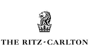
The current logo retains the earlier lion and crown emblem but is given a cleaner, sharper, and more modern look. The text has been changed wherein the typeface depicting the brand name has become bolder to convey strength and modernity. The thicker and weightier style of text enhances visibility and modernity.
The Elements of the Ritz-Carlton Logo
Font
The wordmark used in the Ritz-Carlton logo is in uppercase and is written in the traditional serif typeface. The individual letters of the wordmark have elongated sharp serifs at their ends. The font used is similar to Goudy Modern MT Bold or Romulo Semibold.
Colour
The colours used in the Ritz-Carlton logo are black and white to create timelessness and sophistication.
Finally
The Ritz-Carlton logo evolution reflects the ongoing commitment of the brand to luxury, innovation, and guest-centric service. So, what began as a symbol of noble refinement has transformed into a modern and streamlined incarnation. The lion and crown emblem in the logo continues to embody the promise of an extraordinary experience. It conveys timelessness and one that is attuned to the expectations of today’s global travellers.