The famed St. Regis Hotels & Resorts was founded in 1904 by John Jacob Astor IV, who was a visionary entrepreneur of the Gilded Age. He sought to create a hotel that embodied both technological innovation and uncompromising luxury. The visual identity of the hotel, in the form of its logo, has undergone a few changes over the years. This article delves into these logo changes, among other details of the company.
The Genesis of the St. Regis Hotels & Resorts Logo (???? – 2003)
The earliest representations of the St. Regis Hotels & Resorts brand in the form of its logo reflected the opulence and aristocratic sensibilities of the Astor family and the Gilded Age. The original logo had a crest-like emblem in a golden and white colour combination with heraldic overtones. It contained the abbreviated letters overlapping each other.
It was intended to convey tradition, exclusivity, and timelessness. Beneath the emblem was placed the wordmark in two levels in monochrome. The wordmark “St. Regis” in uppercase is written using a bold sans-serif typeface, while “Hotels & Resorts” is written in a title case in italics.
(2003 – 2005)
The next logo iteration was in monochrome, where the stylised intertwined letters of the emblem in white were depicted against a black background. Below the emblem was written the brand name using a serif typeface, where the letters had double outlines in most parts only to coalesce into forming pointed serifs.
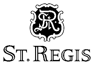
(2005 – 2017)
The next logo change in 2005 saw the emblem with ornate designs on the margins embracing a combination of a white and brown colour palette. The brand name was written below in black, bold uppercase with pronounced serifs in a typeface called St. Regis Roos. The letter “T” was a little shorter and appeared with a tiny black diamond shaped rhombus below it.

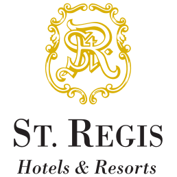
(2017 – Present)
Today, the St. Regis logo features a stylised crest with the intertwined “SR” monogram. It is displayed in a minimalist, monochromatic palette. The brand name is replicated from the previous iteration. This modern yet classic visual identity is deployed across all brand touchpoints.

The Elements of the St. Regis Hotels & Resorts Logo
Font
The primary typeface used in the logo and brand identity is St. Regis Roos. This serif font features sloping stems, slightly cupped serifs, and a tall, distinguished lowercase style. The design intention behind this font is to convey a sense of classic sophistication and heritage. Besides, it aligns with the brand’s identity as a luxury hotel rooted in tradition yet modern in expression.
Colour
The colour palette used in the logo is predominantly black, white, and cool grey. The latter is a neutral grey tone used to maintain a refined and understated aesthetic suitable for luxury branding. These colours are applied consistently across to ensure clarity and elegance in various contexts, whether in print, digital media, or physical signage.
Finally
The St. Regis Hotels & Resorts logo has journeyed from ornate, heritage-inspired designs to a refined, contemporary crest, mirroring the brand’s evolution from a single New York landmark to a global icon of luxury hospitality. Each iteration of the logo has balanced reverence for tradition with the need to remain relevant in a changing world, ensuring that the St. Regis identity remains synonymous with elegance, innovation, and timeless appeal.