Salesforce is a US-based software company that is a global leader in providing customer relationship management (CRM) solutions. Founded in 1999 by Marc Benioff and a team of co-founders, Salesforce revolutionised enterprise software solutions by introducing a cloud-based platform. It empowers organisations to manage sales, service, marketing, commerce, and analytics all in one place.
The Salesforce logo is one of the most recognisable symbols in the IT industry. It shows the evolution of the company from a disruptive startup to a global leader in cloud computing and customer relationship management (CRM). Its journey is marked by strategic design choices that reflect both the company’s mission and broader trends in branding. The article delves into the evolution of the Salesforce logo, among other details of the company.
The Genesis of the Salesforce Logo (1999 – 2014)
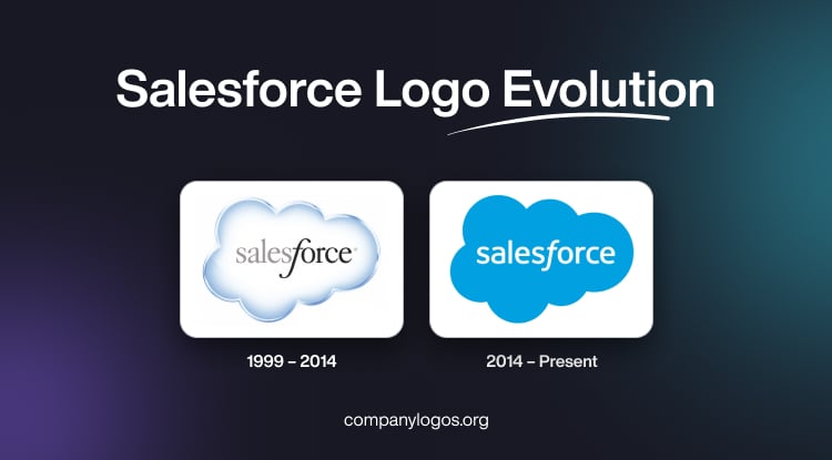
The original Salesforce logo featured an apparent three-dimensional image of a cloud in a gradient light blue and white colour with a silver outline. At the centre of the cloud appeared the brand name “Salesforce” in title case and written using a classy serif typeface but in different colours and styles. For instance, “Sales” was displayed in calm grey, while “force” was displayed in black.
However, the stylised and slanted letter “f” had an elongated vertical bar the ends of which were curved on opposite sides at the top and bottom. The letter “f” appeared as a delimiter between the two parts of the brand name. In fact, the black shade for “force” emphasised the word more for the brand.

(2014 – Present)
In 2014, Salesforce undertook a significant redesign to align with contemporary design trends and the expanding influence of the company. The updated logo retained the iconic cloud shape but embraced simplicity and modernity. For instance, the 3D gradient and silver outline were removed in favour of a flat, solid “Rich Electric Blue” cloud with white lettering.
The wordmark “Salesforce” became entirely white and is written using a clean and sharp sans-serif typeface. This enhanced legibility and brand consistency. The overall look of the logo became more minimalist. It reflects the brand’s focus on user-friendly, streamlined solutions.

The Elements of the Salesforce Logo
Font
The wordmark present in the Salesforce logo uses a sharp sans-serif typeface that looks like the Aller Regular sans-serif font. The letter “f” present in the wordmark is the italicised variant of the same typeface.
Colour
The colour palette used in the Salesforce logo includes rich electric blue, white, grey, and black.
Finally
The Salesforce logo has evolved from a disruptive anti-software symbol to a symbol of cloud innovation and global connectivity. Each logo iteration has balanced the need for modernity with the importance of brand consistency. The logo continues to remain relevant and instantly recognisable in a rapidly changing tech landscape.