Skip to content
Home » Famous logos » The History and Evolution of the Rogers Communications Logo

The History and Evolution of the Rogers Communications Logo

Rogers Communications Logo Evolution

Rogers Communications is one of Canada’s leading telecommunications companies, which specialises in delivering a host of services. These include IT, cable TV, wireless communications, telephony, the internet, and media. Based in Toronto, Ontario, Canada, the company was established in 1959 as Aldred Rogers Broadcasting Limited.

The company has a rich history, which gets reflected in the evolution of its corporate logo. The logo iterations over the years show the growth of the company, its technological advancements, and shifting brand philosophy. The article delves into the evolution of the Rogers Communications logo, among other details of the company.

The Genesis of the Rogers Communications Logo (1959 – 1965) (Unavailable)

Rogers Communications started its journey as Aldred Rogers Broadcasting Limited. However, the original logo of the company is not available.


(1965 – 1967)

Prior to the company being named Rogers Communications, Ted Rogers started an AM radio station called CFTR. The logo of this era was the representation of the radio antenna and the signal it emits or receives. The antenna was represented as a thick black pole with pointed ends, while the signal was represented by three black concentric circles.
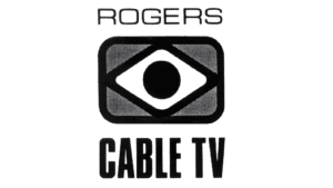
Rogers Communications Logo (1965 - 1967)

(1967 – 1969)

In 1967, Ted Rogers started Rogers Cable TV by collaborating with BARB. The logo of the company then evolved to include the company name “ROGERS” in a prominent sans-serif font above a black-and-white motif resembling an eye or television screen. It signalled a focus on vision and the burgeoning cable TV industry. The phrase “CABLE TV” in a bold typeface anchored the design and emphasised Rogers’ entry into television broadcasting.

Rogers Communications Logo (1967 - 1969)

(1969 – 1986)

In 1969, Rogers adopted a more abstract logo, wherein it retained the eye motif but introduced sharp hexagonal arrowhead shapes and stark black-and-white contrasts. This future-facing aesthetic stripped away detail for bold simplicity to emphasise direction, focus, and a move toward modernity.
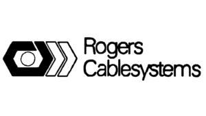
Rogers Communications Logo (1969 - 1986)

(1979 – 1986)

In 1979, the company acquired Canadian Cablesystems and was christened Rogers Cablesystems. This warranted a change in the logo, which featured the wordmark “Rogers Cablesystems” in a playful sans-serif font. The wordmark was preceded by the emblem consisting of a black hexagon with a circle and two white arrowheads with black outlines. This blend of graphic symbolism and textual clarity captured the company’s essence as both innovative and approachable.

Rogers Communications Logo (1979 - 1986)

(1986 – 1990)

The 1986 logo iteration gained colour, with the eye and arrowheads rendered in brown to symbolise energy and passion. The company name “Rogers” appeared in a sleek black serif font, which seemed to balance visual flair with professionalism and signalled boldness and innovation.

Rogers Communications Logo (1986 - 1990)

(1990 – 2000)

In 1990, Rogers dramatically simplified its logo. In doing so, it adopted bold, capitalised red letters and introduced a spherical motif with streaming curves in the place of the letter “o”. This design suggested global reach, speed, and fluid communication.

Rogers Communications Logo (1990 - 2000)

(2000 – 2007)

Marking the new millennium, Rogers unveiled a logo designed by Maclaren McCann Canada, which featured an intertwined, dynamic red ring. Known as the “Mobius strip,” the somewhat darker red ring symbolised unity, continuity, and global reach. To its right appeared the brand name “Rogers” in red uppercase and rendered using a modern sans-serif typeface, similar to the modified variant of the Ocean Sans Standard Bold Extended typeface. The design was clean, stripped down, and forward-looking.

Rogers Communications Logo (2000 - 2007)

(2007 – 2015)

The Mobius strip emblem of the previous logo with a three-dimensional look became more fluid and interconnected. The wordmark grew bolder, with fuller letters for enhanced visibility. The vibrant red colour remained central to reinforce the brand’s energetic and innovative spirit.

Rogers Communications Logo (2007 - 2015)

(2015 – Today)

Designed by Lippincott, the current logo further streamlines the Mobius strip design to present a sleeker and more contemporary loop. The wordmark “ROGERS” remains in bold, spaced-out sans-serif letters to emphasise clarity and modernity. The red colour of the logo has been tweaked to match the Canadian flag, reinforcing national pride and brand consistency. Secondary colours like aqua and yellow have been introduced for flexibility across digital platforms.

Rogers Communications Logo (2015 – Today)

The Elements of the Rogers Communications Logo

Symbol

The emblem used in the logo of Rogers Communications is a convoluted ring with a closed curved line called the Mobius strip. The surface of this emblem does not change even under repeated deformation.

Font

The wordmark used in the Rogers Communications logo is a typeface without serifs.

Colour 

Both the emblem and the wordmark used in the logo have used a combination of a red and white colour palette.

The History of Rogers Communications

The origins of Rogers Communications can be traced back to 1914, when Edward S. Rogers Sr. founded the Rogers Vacuum Tube Company. It revolutionised radio technology with the creation of the world’s first battery-less radio. This innovation laid the groundwork for the family’s legacy in Canadian communications. And after the passing of Edward Sr, his son, Edward (Ted) Rogers Jr, carried forward the vision. In 1960, at just 27 years old, Ted Rogers Jr purchased CHFI-FM in Toronto, thereby marking the formal beginning of Rogers Communications.

He soon co-founded Aldred-Rogers Broadcasting and acquired a stake in Toronto’s first private television station, CFTO-TV. By 1962, Rogers had established CHFI (AM), later known as CFTR. In 1967, the company launched Rogers Cable TV to enter the cable television market. The acquisition of Canadian Cablesystems in 1979 significantly expanded the cable operations of the company, and it became publicly traded on the Toronto Stock Exchange.

Throughout the 1980s and 1990s, Rogers Communications continued to expand and innovate. In 1980, the acquisition of Premier Cablevision made Rogers the largest cable company in Canada. The launch of Cantel in 1985 marked Canada’s first national cellular telephone network. This positioned Rogers as a pioneer in mobile communications.

The company was renamed Rogers Communications Inc. in 1986, and it gained operational control of Cantel, eventually acquiring it fully in 1988. In 1994, Rogers made a landmark acquisition of Maclean Hunter Limited. That deal doubled its cable subscriber base and added significant media assets in publishing, radio, and television.

The 2000s and 2010s saw Rogers further diversify and establish its national leadership. In 2004, the acquisition of Microcell Communications (Fido) strengthened its presence in the wireless market. And in 2013, Rogers Communications secured a 12-year exclusive NHL broadcast rights deal. This was a $5.2 billion investment that established the company as a major force in Canadian sports media. During this period, Rogers Communications also invested heavily in high-speed internet infrastructure, digital cable, and smart home security.

In the 2020s, Rogers Communications continued its trajectory of growth and transformation. In 2023, the company completed its $26 billion acquisition of Shaw Communications, thereby majorly expanding its reach in Western Canada and enhancing competition in the telecommunications sector. By 2024, Rogers Communications was focused on integrating Shaw’s operations. It also accelerated the rollout of its 5G network to deliver improved connectivity across the country.

Today, Rogers Communications stands as one of Canada’s largest and most influential providers of wireless, cable, internet, and media services. Its journey from a single FM radio station to a diversified communications powerhouse is a testament to its enduring entrepreneurial spirit and commitment to shaping the future of Canadian connectivity.

Interesting Facts About Rogers Communications

  • Rogers Communications began its journey in 1914 with Edward S. Rogers Sr, who founded the Rogers Vacuum Tube Company and invented the world’s first battery-less radio. He laid the foundation for the family’s communications legacy.
  • The modern company was founded in 1960 by Ted Rogers, who purchased his first radio station, CHFI-FM, at age 27 with a modest loan of $85,000.
  • Rogers Communications was the first company to offer BlackBerry services in 1999.
  • Rogers was a pioneer in Canadian telecommunications. He launched the country’s first national cellular telephone network, Cantel, in 1985. In fact, he did so despite facing initial resistance from its own board to invest in wireless technology.
  • The company grew rapidly through strategic acquisitions. These include Canadian Cable Systems in 1979, Maclean Hunter in 1994 (which doubled its cable subscribers and added media assets), and Microcell Communications (Fido) in 2004.
  • Rogers secured a landmark 12-year exclusive broadcast deal for NHL games in 2013 by investing $5.2 billion.
  • In 2023, Rogers completed a transformative $26 billion acquisition of Shaw Communications. This acquisition expanded its presence in Western Canada and enhanced competition in the telecom sector.
  • The company operates as a communications and media conglomerate offering wireless, cable TV, internet, telephony, and mass media services. It is based out of Toronto, Ontario.
  • Rogers and Bell Canada are often seen as holding a duopoly in Canadian communications. Both the companies own stakes in Maple Leaf Sports & Entertainment and compete nationally with Telus in wireless services.

Finally

The Rogers Communications logo has undergone a remarkable transformation. The early logo iterations were geometric and inspired by broadcast symbols, but today, they have transitioned to a sleek and infinite loop. Each iteration reflects the company’s evolution, technological innovation, and shifting focus toward customer-centricity and national identity.

Besides, the enduring use of red symbolises energy, passion, and a distinctly Canadian presence. This makes the Rogers Communications logo one of the most recognisable in the country’s corporate landscape.

Leave a Reply

Your email address will not be published. Required fields are marked *