Philips is a Dutch multinational company known for innovation and delivering quality products and solutions for a host of industry segments. For over a century, it has been a pioneering force in the electronics industry. Founded on May 15, 1891, the company has truly revolutionised the way we live. In fact, Philips is a trademark of the business conglomerate Koninklijke Philips N.V. and has an array of products.
These are from the fields of electronics, healthcare, consumer goods, medical equipment, and lighting. It goes without saying that the company has crafted a legacy through its iconic logo. The article traces the history and evolution of the logo over the years and gives insight into its transformation, among other details about the company.
The Genesis of the Philips Logo (1891 – 1895)
The journey of Philips began in 1891, when Gerard Philips and his father, Frederik Philips, established a small light bulb factory in Eindhoven, Netherlands. The company’s first logo featured a simple wordmark in a handwritten black italicised font with the name “Philips & Co.” inscribed on a white background. This initial design aimed to establish a recognisable brand identity.

(1895 – 1905)
The logo was redesigned by replacing the graphical monogram with a sophisticated wordmark. In this iteration, the letter “P” overlapped the letter “Co” with a small ampersand sign placed within the arch of the letter “C.” Also, an equal-to sign was placed in the bottom right corner.

(1905 – 1910)
The revamped logo replaced the monogram with uppercase lettering written in a bold serif font. The wordmark had an additional text written in different typefaces.

(1910 – 1915)
The logo designed during this period got rid of the additional lines of text and brought in the inscription “Philips,” written in a geometric serif font. The letters in black were outlined in yellow, with thin white strokes accompanying them.
(1915 – 1921)
During this period, the logo had a two-levelled wordmark and a wavy line underlining each level. Set in a black and modern sans-serif font, the elements of the logo were in black.

(1921 – 1923)
In 1921, the logo embraced a colourful badge with white letters inscribed inside a rectangular banner with a yellow outline. The word “Philips” was mentioned between two yellow wavy lines, wherein the upper portion of the banner displayed an additional text in white. At the same time, in the bottom portion, a white light bulb was shown with rays emanating from it.

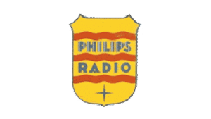
(1923 – 1924)
During this period, the logo badge was displayed in bright yellow with the words “Philips Radio” mentioned in a sans-serif font. The muted blue-coloured words were separated by three bold red wavy lines, and the bottom portion of the badge had a thin pointed star in muted blue.
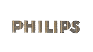
(1924 – 1936)
The period saw the adoption of a minimalist logo with the word “PHILIPS” written in grey with thin yellow stripes. The typeface was geometric sans-serif.
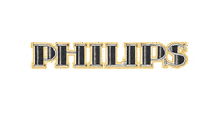
(1936 – 1938)
In this iteration, the Philips logotype was written in a sans-serif font and set in black. The letter “S” was overlapped diagonally with a white decorative element.

(1938 – 1948)
During this period, Philips made significant strides in electronics. It began producing radios, televisions, and various other cutting-edge products. The logo, too, was revisited to reflect these technological advancements. This was the period when the world saw the introduction of the iconic “Philips Wave” symbol. It featured a golden badge or crest with a rounded bottom line and three horizontal yellow wavy lines inside a dark red circle. The lettering was in a bold sans-serif typeface—all capitals. This dynamic and modern design represented the company’s commitment to innovation and progress.

(1948 – 1968)
The Philips badge was redrawn in a monochrome colour palette and placed alongside the word “PHILIPS” written in a geometric sans-serif font.

(1968 – 1995)
As Philips cemented its position as a global player in the electronics industry, the logo was modified further to suit the requirements of the international markets. Thus, although the “Philips Wave” remained the central component, the company’s name was translated into various languages. This ensured brand recognition spread across borders. The logo came in a bold blue wordmark and elements set against a white background.
(1995 – 2004)
During this period, the logo in the form of a badge or crest saw an enlarged logotype in the shade of blue. It had the inscription “Let’s make things better” in a cool cursive font.

(2004 – 2008)
The 2004 logo did not have the crest emblem and the brand name was written in bold and a darker shade of blue. The brand name had the tagline below stating, “Sense and Sensibility” in grey and blue.

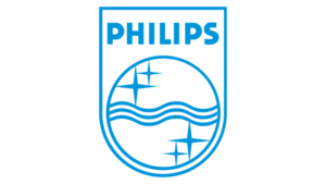
(2008 – 2013)
In this iteration, the monochrome crest was placed on the right side of the monochrome logotype “PHILIPS,” written in uppercase.

(2008 – 2013)
The 2008 logo design did not have any crest emblem, but the brand name. The colour of the letters in the brand name was changed to a more intense shade of blue. Besides, the horizontal bar of the letter “L” was given a diagonal cut. The typeface used to write the logotype was similar to Tanseek Sans Pro Regular and Achates Heavy.

(2013 – Present)
In recent years, Philips has doubled down on its focus on innovation and sustainability. It has positioned itself as a leader in cutting-edge technologies and responsible business practices. And to embody the same, the logo in the form of a crest got an enhanced blue colour palette with the inscription written in white.

The Elements of the Philips Logo
Font
The uppercase Philips wordmark written in a sans-serif typeface is characterized by uniform characters. Since its inception, the symbol has undergone minimal alterations and has maintained its original design elements.
Colour
Over the years, Philips has embraced a steadfast blue colour for its logo. Even though a brighter shade of blue was introduced in 2008, the fundamental appearance remained unchanged.
Finally
The evolution of the Philips logo is a testament to the company’s resilience, adaptability, and commitment to staying relevant in a constantly changing world. Its logo emerged from being a simple wordmark to become a sleek and modern symbol today. It shows the journey of Philips across the realms of technological revolutions, global expansions, and strategic diversifications.