Ameris Bank is the principal subsidiary of Ameris Bancorp, which came into being as a financial institution in 1971 under the name American Banking Company. Based in Atlanta, Georgia, USA, it offers a slew of banking services to both retail and commercial customers in places like Alabama, Georgia, North and South Carolina, and Florida.
The logo of Ameris Bank reflects the visual identity and commitment of the bank to provide a wide range of trustworthy banking and financial services. The article explores the evolution of the Ameris Bank logo over the years. It also dwells on other aspects of the bank, such as its history.
The Genesis of the Ameris Bank Logo (2005 – 2010)
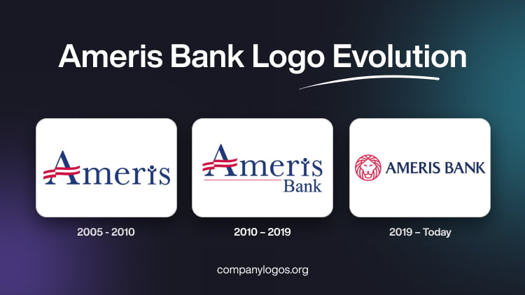
The original logo had featured the bank’s name “Ameris” in title case, and a red-and-white banner had replaced the horizontal bar of the letter “A”. It symbolised the American flag to refer to the patriotic association of the bank. Also, the letter “I” looked like a human-like figure with raised arms. This symbolised the triumph associated with financial success. Written using the Baskerville typeface in blue, the wordmark had sharp serifs, both at the top and bottom.

(2010 – 2019)
The first logo change of 2010 saw the addition of the word “Bank” to the previous wordmark, especially to the bottom right. This made the logo more recognisable to customers. Also, the word “Ameris” was underscored by a thin red line to resemble the timeline associated with the growth of the bank. The wordmarks were in blue to represent the colours of the American flag. Also, the cool and calm blue colour conveyed a sense of trust and stability. These were the qualities that were needed for any financial institution to operate in a complex and competitive landscape.

(2019 – Today)
With competition hotting up in the financial sector and the increasing demands of the digital age, Ameris Bank recognised the need to adapt its visual identity to thrive in such a landscape. Thus, with the rise of online banking and digital platforms, the bank’s logo underwent another evolution to ensure its visibility and relevance in the digital space.
The present logo has been crafted by Matchstic, an Atlanta-based design agency. The latest logo is a combination of the emblems of both Ameris Bank and Fidelity Bank, which merged. For instance, the old Fidelity Bank logo had the face of a lion and the company name in bold, uppercase rendered in a sans-serif typeface.
In the present logo, the human-like letter “I” and the banner replacing the horizontal bar of the letter “A” in the previous logo were removed. And a new graphical element of a happy-looking lion was inspired by the Fidelity Bank logo. The current Ameris Bank logo exudes a sense of confidence, trust, professionalism, and approachability. It reflects the determination of the bank to innovate and offer customer-friendly services. Again, the blue colour palette of the original logo remains so to emphasise the reliability of the bank and its embrace of the digital future.

The Elements of the Ameris Bank Logo
Font
The wordmarks in the Ameris Bank logo are rendered in a classic sans-serif typeface, which is much followed in the banking industry.
Colour
The overall logo is set in a deep, rich blue colour to symbolise trust and stability. And if the logo is presented in reversed form against a dark background, it appears in crisp white as well.
Finally
The logo of Ameris Bank has undergone a change to reflect the growth, expansion, and dedication of the bank to serve its customers. The journey of the bank has been truly transformative, right from its humble beginnings as the American Banking Company to its present-day status as a modern and innovative financial institution. Through the logo iterations, Ameris Bank has maintained a delicate balance between embracing modernity and honouring its heritage. It has ensured its visual identity in the form of its logo to resonate well with customers, both old and new.