Ally Financial is a leading digital financial services company based in Detroit, Michigan, USA. Established in 1919 in Delaware by the General Motors Corporation, it offers a wide range of financial products and services. These include auto financing, online banking, corporate loans, mortgages, insurance, stock trading, and investment management. The logo of the company, which also happens to be its visual identity, did change a few times since it came into effect in the 1950s. This article delves into the history and evolution of the Ally Financial logo over the years.
The Genesis of the Ally Financial Logo (1950 – 2000)
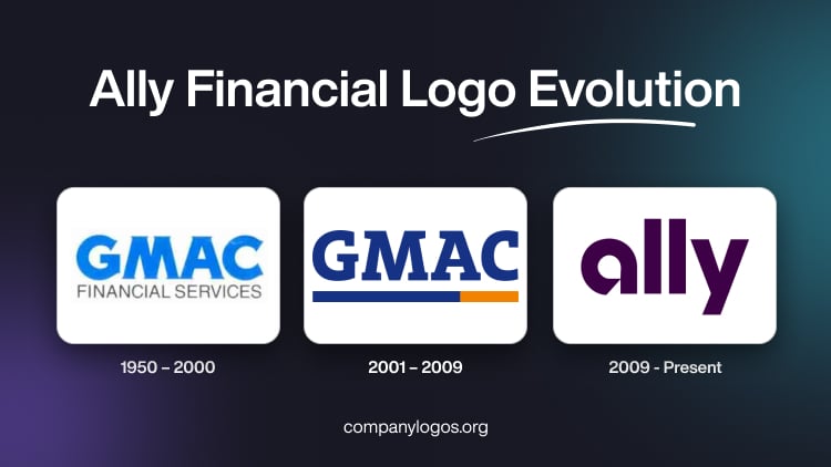
The predecessor of Ally Financial was the General Motors Acceptance Corporation, or GMAC, which provided financing options for General Motors customers. So, the first logo of GMAC had the abbreviation in uppercase and sported a light blue colour. Written in a serif typeface, the letters of the wordmark had softened contours and rounded angles.
Under the wordmark was mentioned “FINANCIAL SERVICES” in an unembellished typeface. It focused on clarity and straightforwardness. Moreover, the overall logo did not display any extra embellishment beyond the simple and standard lettering. It just expressed practicality and professionalism.

(2001 – 2009)
With the dawn of the new millennium, the logo of the GMAC Bank evolved further to reflect the modern banking landscape. In 2001, the company introduced sleek and contemporary GMAC lettering in uppercase. This logo iteration adopted a bold and minimalist appearance that resonated with the digital age. Here, the “GMAC” lettering appeared in a deep blue colour palette.
And below the lettering was a horizontal stripe of which three-fourths were marked in navy blue and about one-third in vibrant orange colours. Importantly, there was no additional text, unlike in the earlier logo avatar. The new logo design aimed to convey professionalism, stability, and a forward-thinking approach to financial services.

(2009 – Present)
The current logo of the bank displays sophistication and warmth through a custom wordmark that is woven in a plum shade. The unique letterforms of the wordmark have rounded edges and gentle curves. These evoke a sense of approachability and reliability.
The plum colour itself is a thoughtful choice, for it stands out from the traditional colours that are associated with financial institutions. It conveys a sense of confidence and individuality and reflects the commitment of Ally Financial to challenging industry norms. Besides, it offers innovative banking solutions that are tailored to the needs of their customers.
Furthermore, the logo design shows a subtle gradient effect to add depth and vibrancy to the overall visual identity. This gradient symbolises the continuous growth and evolution of Ally Financial while remaining true to its core values.

The Elements of the Ally Financial Logo
Font
The Ally Financial logo uses the custom Benton Sans font across various media platforms, including print, outdoor advertising, web, and mobile. One of the most distinct elements of the wordmark is the letter “y,” which does not contain the curved design found in the Benton Sans typeface. Instead, the letter “y” in the Ally Financial logo features a more linear and straightforward appearance. This reinforces the individuality of the logo further.
Another characteristic that makes the wordmark different is the unique shape of the letter “a.” So, unlike the traditional “a” found in the Benton Sans font, the “a” in the Ally Financial logo features a custom design where the end part of the letter cuts diagonally. Further, the curved end of the letter “a” at the bottom does not fuse with the stem and leaves a gap. This adds to the overall uniqueness of the visual identity of the brand.
Colour
Complementing the custom wordmark of the logo is the signature plum colour. This rich and vibrant colour features prominently across various touchpoints. The plum colour has become an instantly recognisable representation of the Ally Financial brand. It further adds to its visual identity and enhances brand recall among consumers.
Finally
The journey of the logo from representing GMAC to its current iteration of representing Ally Financial proves the resilience, adaptability, and commitment to innovation of the company. Each iteration of the logo reflects the evolving identity, values, and strategic direction of the company. Besides, it serves as a powerful visual representation of its brand essence.