KDDI Corporation is a major Japanese telecommunications operator formed through the strategic merger of several leading companies in the industry. Its history reflects the evolution of Japan’s communications sector and the company’s drive for innovation and comprehensive service. The visual identity of KDDI Corporation, especially its logo, has evolved alongside the company’s growth, technological advancements, and shifting market strategies. The article delves into the evolution of the KDDI Corporation logo, among other details of the company.
The Genesis of the KDDI Logo (1978 – 1996)
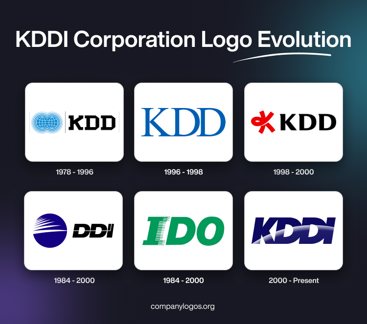
Among the three companies that merged to form KDDI Corporation, one was KDD Corporation (Kokusai Denshin Denwa), the logo of which was designed by PAOS Dentsu. The first logo of KDD, which was established in 1953 as a government-owned entity focused on international telecommunications, was not documented. It was only in 1978 that the first change logo of KDD was designed. It featured two globe-like spheres in blue and white coalesced together and accompanied by the abbreviation “KDD” in a black custom sans-serif typeface to the right. The emblem and the wordmark were separated by thin grey vertical lines.

(1996 – 1998)
In this KDD logo of 1996, the globe-like spheres were removed, and only the wordmark “KDD” in a blue custom sans-serif typeface remained. The serifs of the letters were pointed and were set against a white background. Also, the lower ends of the letters “K” and “D” were connected.

(1998 – 2000)
In the KDD logo iteration of 1998, a graphical emblem comprising the letter “K” forming a knot in red appeared to the left of the wordmark “KDD” in black. The letters of the wordmark had small serifs and were written in a sans-serif typeface with adequate spacing between the letters.

(1984 – 2000)
Another telecommunications company that went on to form “KDDI” was DDI Corporation (Daini Denden). Its logo consisted of a graphical emblem (a blue sphere with a series of white streaks) along with the abbreviation “DDI”. A thin white line emanating from the longest white streak inside the blue sphere traversed through the letterforms. The thin white line cutting the letters into two halves culminated in a small white line moving upward in the letter “I”.

(1984 – 2000)
IDO was the third company the merger of which resulted in the formation of KDDI Corporation. The logo of IDO featured italicised, bold, and block-shaped letters written using a sans-serif typeface in green. The letter “I” saw several small horizontal lines, both thick and thin, emanating along the right side of the letter. The alternating thin and thick lines extended from the letter “I” gave the impression of a piano.

(2000 – Present)
In October 2000, DDI Corporation, KDD Corporation, and IDO Corporation merged to form a new entity. It initially retained the DDI name but was soon rebranded as KDDI Corporation in April 2001. This merger was a landmark event and symbolised the unification of international, domestic, and mobile telecom services under one corporate umbrella.
The first KDDI Corporation logo was designed to reflect this unity and forward-looking vision. It featured the abbreviation “KDDI” written using a block, bold, and slightly italicised sans-serif typeface in a deep blue colour. There was a white gradient arc drawn across the abbreviation. The blue colour palette was retained to reinforce the brand’s commitment to trustworthiness and innovation. Besides, the logo’s simplicity allowed for easy recognition and adaptability across various media.

The Elements of the KDDI Corporation Logo
Font
The KDDI Corporation logo features a clean, modern sans-serif font that emphasises simplicity and clarity. It reflects the focus of the company on reliability and technological advancement. The geometric and bold typeface is designed for high legibility across digital and print media. Besides, it aligns with KDDI’s identity as a leading telecommunications provider.
Colour
The colour of the KDDI Corporation logo is a distinctive shade known as “KDDI Blue”. This blue shade is carefully chosen to convey trust, stability, and professionalism. The consistent use of this blue colour across all branding materials helps unify the company’s image and makes the logo instantly recognisable to customers.
Finally
The KDDI Corporation logo has evolved from a symbol of corporate merger to an icon of innovation in Japanese telecommunications. Its consistent use of blue, clean typography, and adaptability across platforms reflect the company’s values of trust, reliability, and forward-thinking. Also, through sub-brands like “au”, digital transformation, and a clear brand message, the KDDI Corporation logo remains a recognisable and respected mark in the telecom industry.