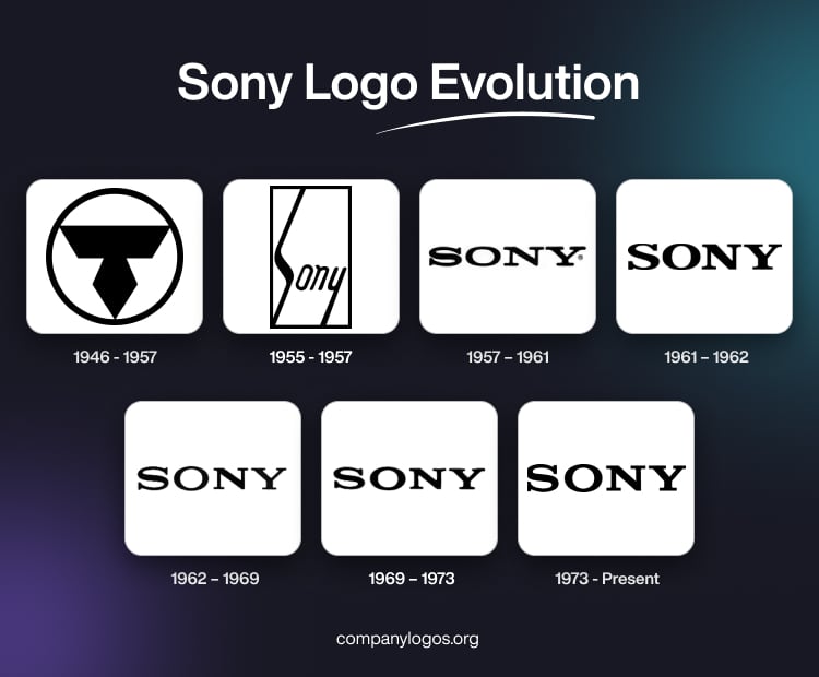
Sony Corporation is a renowned Japanese multinational company that operates in various sectors, such as electronics, gaming, entertainment, and financial services. The Sony logo has undergone a remarkable transformation over the years and reflects the company’s growth and evolution. The article traces the evolution of the Sony logo and the history behind the company, among other details.
The Genesis of the Sony Logo (1946 – 1957)
The first logo of the company featured a monochrome roundel with an abstract geometric figure inside. Drawn in black, the geometric figure, set against a white background, was created in the form of a trapezoid with its base up, while a rhombus was connected to its bottom part, the bottom end of which touched the thick edge of the roundel.

(1955 – 1957)
In 1955, the company changed its name to Sony Corporation. The new Sony logo featured a stylized “S” symbol, which was inspired by the visual representation of the letter “S” in an electromagnetic wave form. It featured a stylized wordmark with a distinct typeface and a unique design element. This emblem used to be prominently featured on Sony’s products and marketing materials, which helped it create a strong brand identity. The logo had elongated italic letters “S” and “y” placed in a rectangular frame.

(1957 – 1961)
In 1957, Sony updated the typography of its logo by opting for a more modern and streamlined look. As the company expanded globally, the logo was changed by removing the rectangular frame and using the inscription “Sony” in a bold serif font. Also, by consistently using the Sony logo across international markets, the brand became recognised globally.

(1961 – 1962)
The logo was further improved by making the letter “S” little bigger than the rest. The other iterations of the logo differed in the use of altered font and bold letters.

(1962 – 1969)
In this logo iteration, the design was made sharper and the serifs of the wordmark were straightened. The contours of the letters were made a little thinner, which added the quality of timeless elegance to the logo. The monochrome colour of the logo was retained for continuity.

(1969 – 1973)
In the 1969 logo iteration, the serifs of the letters of the wordmark were rounded at the corners. This wordmark looked more balanced when compared to the previous ones, and it exuded a sense of confidence and professionalism.

(1973 – Present)
With the advent of the internet, Sony simplified its logo to get better visibility and adaptability. The logo was seamlessly integrated into Sony’s multimedia and online presence, thereby ensuring brand consistency across various channels. In recent years, subtle updates have been made to the logo to refine its design. At the same time, the essence of the brand has been preserved. In 1973, Norio Ohga, the CEO, was satisfied with the iteration of the logo. Using the font Clarendon with slight modifications, the logo used black on a white background to symbolise elegance and integrity.

The Elements of the Sony Logo
Symbol
The current version of the Sony logo features a straightforward logotype that was introduced in 1959. According to branding experts, this logotype conveys simplicity and resilience and has seen minor adjustments over time. This was done primarily under the guidance of the former Sony president and chairman, Norio Ohga. Besides, these refinements were predominantly overseen by Sony’s chief of design, Akio Morita, and designer Yasuo Kuroki. In 2009, Sony adopted its current slogan, “Make Believe.”
Font
Sony’s logo uses a slightly customised version of the Clarendon font.
Colour
The Sony logo is black in colour, which represents attributes such as integrity, excellence, sophistication, and the brand’s rich heritage.
Finally
The Sony logo has evolved significantly over the years and reflects the company’s journey from a small electronics manufacturer to a global powerhouse. Throughout its transformations, the Sony logo has remained a powerful symbol. It represents the brand’s commitment to innovation, quality, and design excellence.