
Funko is a well-known US-based company that produces licensed collectibles representing famous characters related to pop culture, including the famous Pop! Vinyl figures. It was established in 1998 by a toy collector, Mike Becker, and has since changed ownership a few times. Besides collectibles, the brand is known for producing clothing, plush toys, and accessories.
The Funko logo too has evolved significantly since the company’s inception. Its evolution reflects Funko’s journey from a small bobblehead manufacturer to a global pop culture phenomenon. Each logo iteration captures the spirit and growth of the company. The article explores the various logo changes undertaken by the company over the years since it came into being.
The Genesis of the Funko Logo (1998 – 2006)
The original Funko logo featured the brand name in a quirky, playful and bold typeface in monochrome. Each letter of the brand name was distinct, with the letter “F” standing tall and carrying a whimsical crown above it. It arguably symbolised the regal aspirations of the brand in the collectibles market. The letters “u” and “n” were closely placed to create a friendly and accessible vibe, while the letter “k” in uppercase tilted slightly for a dynamic touch. Every alternate letter of the logo is enclosed within an inverted black trapezoid to resemble shelves or boxes for displaying collectibles.
The “o” rounded out the name with simplicity and strength. The black and white colour scheme gave the logo a classic, versatile look, which was suitable for both physical and digital platforms. The varying letter sizes and playful crown design evoked a sense of fun. These aligned perfectly with the brand’s core identity.

(2006 – 2015)
The logo was updated again in 2006 after the change in the ownership of the company. The new logo retained the boldness of the original but featured more uniform, bold, and block letters, such as “u”, “n”, “k”, and “o”. It reflected a more cohesive and mature brand image.
The crown was simplified, with fewer details, which enhanced its visual impact and made the logo more adaptable across various media. The stark black-on-white colour scheme ensured strong visibility and maintained the logo’s classic appeal. This streamlined appearance showed the growth of Funko and its rising profile in the collectibles industry.
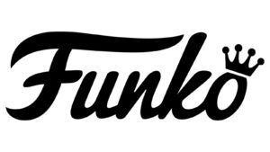
(2015 – Present)
By 2015, Funko had firmly established itself as a leader in the pop culture collectibles market, thanks in large part to the explosive popularity of its Pop! Vinyl figures. The logo underwent another transformation, wherein it adopted a fluid and cursive handwritten style to symbolise elegance and continuity. The “F” flourishes confidently and connects seamlessly to the rest of the letters. The crown, on the other hand, once atop the “F”, now sits on the “o” to suggest playfulness and ongoing growth.
This new design contrasts with the older, bolder styles and adds a layer of sophistication. It also maintains the playful spirit of the brand. The logo is recreated in blue to symbolise simplicity, lightness, and accessibility. It also keeps the logo visually striking. This evolution signals Funko’s commitment to staying fresh and relevant in a rapidly changing market.

The Elements of the Funko Logo
Font
The Funko logo uses a flowing and cursive handwritten script. The letters of the wordmark have smooth lines to emphasise the playfulness and casual nature of the brand.
Colour
The Funko logo uses blue colour to convey creativity, simplicity, lightness, and accessibility.
The History of Funko
Funko was founded in 1998 by Mike Becker in his living room in Snohomish, Washington. He initially started it as a passion project focused on creating toys that are low-tech and themed on nostalgia. Becker, who was a toy collector, was inspired to start the company after he couldn’t find an affordable collectible figure of the Big Boy restaurant mascot. Instead, he licensed the rights to create his own coin banks and later bobbleheads. He launched the first product line of the company called Wacky Wobblers that featured characters with distinctive nodding heads.
The early years of the company were marked by struggle and ingenuity. Funko faced financial difficulties after its Big Boy coin banks failed to sell and the associated franchise went bankrupt. However, Funko survived by changing the product line to bobbleheads, most notably with the Austin Powers figure. This went on to sell 80,000 units and helped establish the brand. Early successes also included the Grinch, Tony the Tiger, and the Cheerios honey bee mascot.
In 2005, Becker sold Funko to Brian Mariotti, who moved the company’s offices to Lynnwood, Washington, and began expanding its licensed product lines. The acquisition marked a turning point, as Funko started securing deals with major entertainment companies like Warner Bros., Paramount, Disney, and Marvel. These deals allowed it to produce collectibles based on popular franchises.
A major milestone came in 2010–2011 with the launch of the Pop! Vinyl line. Originally called Funko Force 2.0, these stylised vinyl figures were launched with characters from DC Comics and quickly became a cultural phenomenon. The distinctive design of the Pop! Vinyl line featuring oversized heads and black eyes set it apart in the collectibles market and fuelled Funko’s rapid growth. The company sold over $20 million in merchandise by 2012 and has since expanded its portfolio to include plush toys, apparel, accessories, and more.
Funko’s ownership has changed hands several times since its founding. In 2013, it was sold to Fundamental Capital, a private equity firm, and then to ACON Investments in 2015. Despite these changes, Funko has continued to innovate and expand. It acquired brands like Loungefly and secured hundreds of licences for iconic characters from movies, TV, sports, and more.
Today, Funko is recognised worldwide as a leader in pop culture collectibles, with its Pop! Vinyl figures being the most recognisable and sought-after products. The brand’s success is rooted in its ability to tap into nostalgia, secure major licenses, and cultivate a passionate global fanbase.
Interesting Facts About Funko
- Funko was founded in 1998 by Mike Becker in his home in Snohomish, Washington, after he couldn’t find an affordable collectible of the Big Boy restaurant mascot and decided to make his own.
- The first Funko item was a bobblehead of the Big Boy mascot. It helped launch the original “Wacky Wobblers” line of the company.
- Early on, Funko struggled financially, especially after its first Big Boy coin banks failed to sell and the associated franchise went bankrupt. The company was saved by licensing the rights to make bobbleheads for Austin Powers, which sold 80,000 units.
- Funko Pop! Vinyl Line debuted in 2010–2011 at San Diego Comic-Con. It featured DC Comics characters like Batgirl, Green Lantern, and Batman. These figures became instant collectibles and remain highly sought after.
- The rarest Funko Pop is the Willy Wonka Golden Ticket 2-Pack, with only 10 ever made. One of each of these sold for $210,000 in 2023.
- Funko holds over 150 licenses, which include Disney, Marvel, Star Wars, Harry Potter, NBA, and many more. These licences make it one of the most diverse pop culture collectible companies in the world.
- Funko is based in Everett, Washington, which serves as both an office and a tourist destination. It features a massive store, themed zones, and even a life-size Batmobile from the 1960s TV series.
- Funko has grown into a major company, with revenues exceeding $913 million in 2021. It is driven by the enduring popularity of its collectibles.
- In 2019, Funko acquired Loungefly, which was a popular brand known for its pop culture-themed backpacks and accessories.
- Funko’s headquarters offers free workshops on weekends for fans that are interested in art, sculpture, and illustration.
Finally
The Funko logo has evolved from being a creator of nostalgic bobbleheads to its current status as a pop culture powerhouse. Each logo iteration has maintained a balance between playful charm and professional polish. It has helped Funko stand out in the crowded collectibles market. The logo’s evolution is a testament to the brand’s adaptability, creativity, and enduring appeal to fans around the world.