Asahi Group Holdings, Ltd., established in 1889, is a global leader in the beverage and food industry, headquartered in Sumida, Tokyo, Japan. The Group offers a diverse portfolio of brands centred on beer, alcohol and non-alcohol beverages, and food products. Asahi Group Holdings has a global presence, such as in Japan, East Asia, Europe, Asia Pacific, and Oceania.
It provides over 10 billion litres of beverages to consumers worldwide and generates revenues of over JPY 2.9 trillion annually. The Group’s visual identity in the form of its logo has changed over the years and reflects both its Japanese heritage and its ambitions as a global enterprise. The article explores the logo evolution of the Asahi Group Holdings, among other details of the company.
The Genesis of the Asahi Group Holdings Logo (1889 – 1986)
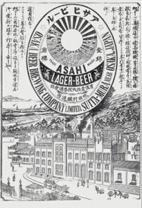
Since the Asahi Group Holdings company started as the Osaka Beer Brewing Company in 1889, the earliest logo alluded to the predecessor company. It was closely tied to its Japanese roots and the symbolic meaning of its name, Asahi, “morning sun” in Japanese. The original logo in monochrome featured an elongated oval with two outlines, inner and outer. There were several illustrations in Japanese within the inner oval.
Between the inner and outer outlines, or the circumference of the oval, was mentioned the brand name “OSAKA BEER BREWING COMPANY LIMITED” and the location of the brewery in both English and Japanese. At the top centre of the oval was shown the sun motif along with the words “ASAHI” in black against a white background and “LAGER BEER” in white against a black striped background arched below.
(1986 – 2024)
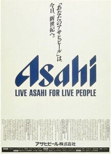
A key moment in Asahi’s visual evolution came about when renowned designer Nagai Kazumasa was commissioned to redefine the company’s logo and overall brand direction. So, in 1986, Kazumasa introduced a “sharp” and angular typeface, with each letter forming a pointed, dynamic shape reminiscent of Gothic letterforms. This design aimed to convey a sense of growth, energy, and modernity. Below the wordmark “Asahi” in title case was mentioned the tagline, “LIVE ASAHI FOR LIVE PEOPLE” in a smaller size in uppercase.
The signature blue colour for the wordmark was chosen to represent water, a key ingredient in Asahi’s products, and to evoke a feeling of refreshment. This rebrand coincided with the launch of Asahi Super Dry, a product that would become synonymous with the brand and help propel Asahi to market leadership in Japan.
(2024 – Present)
In April 2024, Asahi Group Holdings unveiled a new group corporate logo to reflect its evolution into a truly global organisation. The updated logo retains the established Asahi wordmark but introduces two key elements as mentioned below:
- The ‘Sunrise Arc’: It is a symbol that symbolises the morning sun (asahi) and represents the aspiration of the company to brighten the world. The fan shape of the arc radiates from the word “GROUP” to signify the company’s potential and global ambition.
- Colour Palette: The logo employs a blue and yellow colour palette to symbolise the core elements of Asahi’s brand essence, namely, Earth, Sun, water, and light. These colours also represent the balance between tradition and innovation, passion and integrity, and trust and a challenger spirit.

The Elements of the Asahi Group Holdings Logo
Font
The Asahi Group Holdings logo features a distinctive custom wordmark that draws inspiration from both traditional Japanese calligraphy and modern design aesthetics. The font displays sharp, angular forms where each letter comes to a head yet maintains a rounded, gothic-like quality. This unique typographic style was introduced by designer Nagai Kazumasa.
Colour
The Asahi Group Holdings logo uses two main colours: blue and yellow. The blue colour is a deep, rich shade that symbolises water, which is an essential ingredient in Asahi’s beverages. The blue also represents trust, refreshment, and the commitment of the company to quality. On the other hand, the yellow colour in the form of the “Sunrise Arc” symbolises the morning sun (asahi in Japanese). It represents hope, aspiration, and the company’s mission to brighten the world.
Finally
The Asahi Group Holdings logo has evolved from being a symbol of Japanese optimism to a dynamic mark of global ambition. Each logo redesign has built upon the brand’s heritage by using visual elements, such as the rising sun and refreshing blue. The logo designs are aimed at communicating trust, innovation, and a commitment to making the world shine brighter.