Claro is a leading telecommunications company in Latin America that operates under the umbrella of América Móvil, the Mexican telecom giant founded by Carlos Slim. The company offers a range of services, such as mobile, broadband, and television across the region. It has a presence in countries such as Brazil, Argentina, Chile, Colombia, and many more. The logo of Claro has become synonymous with mobile connectivity and innovation, but its visual identity has undergone a few changes since the brand’s inception. The article delves into the logo changes made by Claro, among other details of the company.
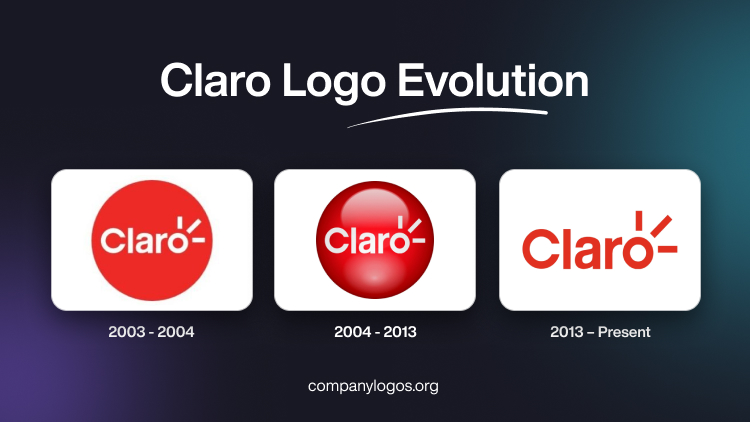
The Genesis of the Claro Logo (2003 – 2004)
The first Claro logo displayed the brand name in white title case inside a bright red circle. The letter “o” in the brand name had three rays in white emanating from it to symbolise waves, brightness, and communication that established the mobile connection. The red colour of the circle is vibrant and energetic, while the white text inside the circle ensures high contrast and legibility. This design has remained largely consistent since its adoption.

(2004 – 2013)
This iteration was a continuation of the original logo design, but with the addition of a gradient, shades, and highlights. These gave the logo an overall three-dimensional look. Besides, the brightness of the logo was reduced.

(2013 – Present)
The current Claro logo does not have the red circle but only the brand name in red against a white background. This design devoid of the outer circle has ensured the logo looks cleaner and minimalist.

The Elements of the Claro Logo
Font
The wordmark representing the Claro logo is rendered in a bold red colour using a sans-serif typeface with soft, rounded lines.
Colour
The Claro logo is depicted in a vibrant red colour palette to symbolise passion, determination, and the drive shown by the company to lead in technology.
Finally
The Claro logo and its various iterations show the growth journey of the company from a collection of regional telecom providers to a unified, pan-Latin American brand. The transition from a simple wordmark to the dynamic red sphere reflects Claro’s commitment to innovation, clarity, and connectivity. Today, the Claro logo is instantly recognisable and stands as a symbol of reliable communication for millions across the Americas.