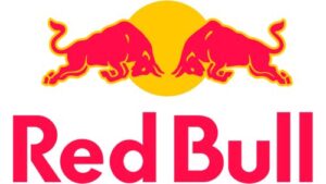
Red Bull is a world-renowned energy drink that was first introduced in 1987 in Austria. Founded by Dietrich Mateschitz and Chaleo Yoovidhya, the caffeine and taurine energy drink was inspired by Krating Daeng, the stimulating drink from Thailand. The Red Bull logo is one of the most iconic and enduring symbols in the beverage industry. It is instantly recognisable for its dynamic depiction of two red bulls charging at each other in front of a golden circle. The article describes the evolution of the Red Bull logo since the inception of the company, among other details.
The Genesis of the Red Bull Logo (1987 – Present)
Red Bull was officially launched in Austria in 1987. The logo that debuted then remains virtually unchanged to this day. The design features two red bulls in a dynamic, head-to-head pose to symbolise energy, competition, and action. There is also a golden circle (often interpreted as the sun) behind the bulls to represent vitality and optimism.
There is a bold, sans-serif “Red Bull” wordmark in bold, modern, and red uppercase letters beneath the emblem. It is rendered in a font that is similar to Futura with minor modifications. This combination of imagery and colour was intentionally chosen to convey urgency, excitement, and premium quality. Red, the dominant colour, evokes energy and passion, while gold suggests excellence and luxury.

The Elements of the Red Bull Logo
Font
The wordmark used in the Red Bull logo uses a bold, massive, geometric, custom Spain Bull proprietary sans-serif typeface. It is similar to Futura SH-Dem Bol, Futura BQ Demi Bold, Futura TS XBold, and Avant Garde Gothic.
Colour
The Red Bull logo employs a gold and red colour scheme, wherein the red colour conveys the power and confidence of the brand, while the yellow colour conveys dynamism and energy.
Finally
The Red Bull logo epitomises the art of branding. It is deeply rooted in cultural symbolism, visually striking, and remarkably consistent. Its evolution is less about change and more about the enduring power of a well-conceived, culturally resonant design that continues to energise and inspire consumers worldwide.