HBO, or Home Box Office, is arguably the oldest television network in the USA. Founded in 1972 by Charles Dolan, the network is currently owned by Warner Bros. Discovery and offers a slew of programmes, such as films, documentaries, and concerts. The HBO logo is one of the most recognisable symbols in the television industry.
It embodies the evolution of the network from a fledgling cable service to a global entertainment powerhouse. Its logo iterations reflect broader shifts in media, technology, and branding over the past five decades. The article delves into the evolution of various HBO logo variations, among other details of the company.
The Genesis of the HBO Logo (1972 – 1973)
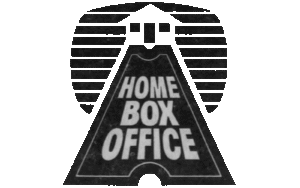
The original HBO logo was markedly different from the minimalist icon we know today. It featured the full name “Home Box Office” in a Westinghouse Regular font and was set inside a rectangular marquee design surrounded by several ticket stubs. The top part of the logo featured two envelopes to create a triangular roof. This ornate approach was intended to evoke the experience of going to the movies, but the logo’s complexity made it difficult to remember and reproduce, especially as the network sought wider recognition.

(1973)
The 1973 logo redesign saw the removal of the ticket stubs and envelopes and the simplification of design. Set in monochrome, the logo featured the image of a house in white against a black background with white horizontal stripes. The approach to the house was built using an elongated, stylised ticket upon which the name of the company was written using a geometric sans-serif typeface.
(1973 – 1975)
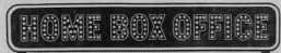
The 1973 logo variation featured the full brand name within a rectangular figure created by depicting a lighted marquee in three layers. There was the image of a ticket stub just beside the brand name.
(1973)
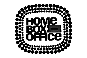
In another logo iteration of 1973, the logo design featured the brand name in white outlines studded with marquee lights. It was set against a horizontally oriented rectangle in black with grey edges. There was a thin black outline with rounded corners surrounding the black background and inside the pointed grey rectangle.
(1975 – 1980)
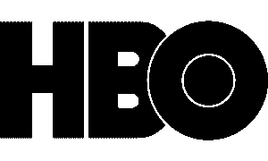
In 1975, HBO introduced a radically different logo that set the stage for its enduring identity. Designed by Bemis Balkind, the new mark used only the initials “HBO” in a bold, uppercase sans-serif font. It seems like a heavily modified version of Avant Garde Gothic. The most distinctive feature of the logo was the letter “O”, which contained a solid black circle and overlapped the letter “B”. This evoked the imagery of a camera lens or film reel.
This design was cleaner, more memorable, and symbolically aligned with the network’s cinematic ambitions. The black-and-white palette of the logo was chosen for its sophistication and versatility. It became a defining trait that allowed the logo to stand out on any background.
(1980 – Present)
As HBO’s reputation for original programming grew in the 1980s, the logo underwent subtle refinements. In the 1980 design, the font was rounded and emboldened. The letters were given a three-dimensional effect that suggested modernity and prestige. Besides, the white circle within the letter “O” was made thicker.
The Elements of the HBO Logo
Font
The wordmark that forms the visual identity of HBO is written using a sans-serif typeface in uppercase. It has an uncanny resemblance to Avant Garde Gothic.
Colour
The HBO logo has continued to adhere to its monochrome black and white colour scheme.
Finally
The logo of HBO and its various iterations show the trajectory of the network – from a niche cable service to a global leader in entertainment. Its minimalist, adaptable design has allowed it to remain relevant through decades of technological and cultural change. It stands as a symbol of quality and innovation in storytelling. Even as the brand expands into new platforms and content types, the core visual identity endures, which is a testament to the power of thoughtful, timeless design.