Skip to content
Home » Famous logos » The History and Evolution of the Bell Canada Logo

The History and Evolution of the Bell Canada Logo

Bell Canada Logo Evolution

Bell Canada, commonly referred to as Bell, has been a major player in the telecommunications industry in Canada. Founded in the late 19th century, Bell Canada provides a range of services, namely, television, radio, mobility and fixed line telephone services, and the internet. The Bell Canada logo has evolved in tandem with technological advances, market trends, and corporate strategy. This article explores the rich history and various iterations of the Bell Canada logo, among other details, since the inception of the company.

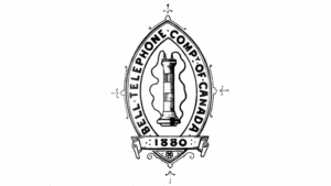
The Genesis of the Bell Canada Logo (1880 – 1891)

In 1880, Bell Canada used to be called the Bell Telephone Company of Canada. The initial logo of this company featured a monochrome elliptical shield with the image of a vertically oriented telephone receiver inside. The full name of the company was displayed along the edges of this shield. The bottom of the shield had a ribbon with “1880” inscribed on it and ornate patterns along its edges.
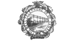
Bell Canada Logo (1880 – 1891)

(1891 – 1895)

The original logo design was changed in 1891, wherein it attained the shape of a circle. The double-edged outline of the circular emblem displayed the inscription “BELL TELEPHONE CO. OF CANADA”. Surrounding the circular emblem were the leaves of ivy, which gave the impression of a volumetric frame. Inside the circular emblem was shown an industrial landscape with telephone poles transmitting telephonic signals through wires. The bottom of the emblem showed a long wire connected to a telephone receiver, which lay next to an old telephone set.
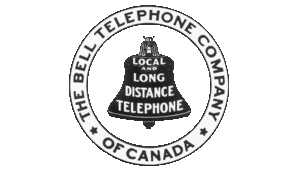
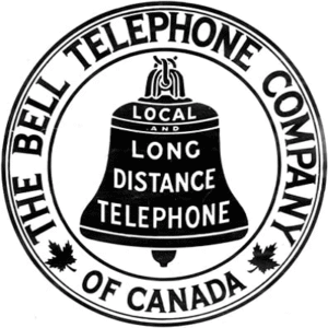
Bell Canada Logo (1891 – 1895)

(1895 – 1902)

In the 1895 logo, the black bell emblem was used for the first time. It was placed at the centre of a circle with a double-edged outline with the inscription “LOCAL AND LONG DISTANCE TELEPHONE” in white. The name of the company was displayed along the outline in black and was separated by asterisks.
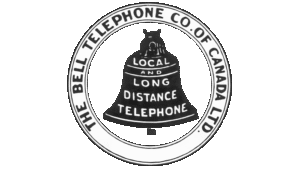
Bell Canada Logo (1895 – 1902)

(1902 – 1922)

The 1902 logo variant saw the design of the bell changed. The font of the inscription was changed as well, and the asterisks were removed. Besides, the abbreviation “LTD” was added to the inscription along the circular emblem with additional rings.
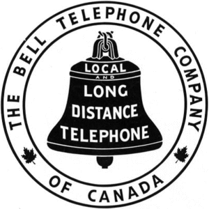
Bell Canada Logo (1902 – 1922)

(1922 – 1940)

In the 1922 logo iteration, Bell streamlined its visual identity by retaining the black bell icon within a circular emblem with texts such as “Bell Telephone Company of Canada”. Also, the asterisks separating the inscription were replaced with maple leaves to symbolise the Canadian underpinnings of the company.

Bell Canada Logo (1922 – 1940)

(1940 – 1947)

The logo of 1940 was a continuation of the earlier logo but with slight modifications. The double rings of the circular emblem were removed, and the inscription, both on the edges of the emblem and the bell icon, was made shorter, simpler, and modern.

Bell Canada Logo (1940 – 1947)

(1947 – 1964)

In this logo iteration, the inscription on the black bell icon was replaced with “SERVICE”. Also, the inscription on the edges of the circular emblem was written using a larger and bolder typeface in black. Incidentally, the size of the bell icon was reduced.

Bell Canada Logo (1947 – 1964)

(1964 – 1972)

In 1964, the regional division of the company was named Bell Canada, and it was inscribed on the bell. The rest of the inscription around the edges of the circular emblem was removed by making the edges of the emblem thick black.

Bell Canada Logo (1964 – 1972)

(1972 – 1976)

Designed by Saul Bass & Associates, the 1972 logo was made simpler and minimalistic. Accordingly, the inscriptions were removed altogether, and the bell icon in black was given a modern look. It acquired a clear geometric appearance without any dividing lines. 

Bell Canada Logo (1972 – 1976)

(1977 – 1994)

In the 1977 logo iteration, the traditional and iconic bell symbol was abandoned. Instead, a large blue and bold inscription “BELL” in title case designed by Don Black using a Univers, rounded sans-serif typeface was unveiled.

Bell Canada Logo (1977 – 1994)

(1994 – 2009)

Designed in-house by Gilles Brault, the 1994 logo comprised a yellow emblem and blue inscription in italics using a Frutiger typeface. The emblem consisted of several yellow lines curved to appear like the outline of a human visage and two open rings.

Bell Canada Logo (1994 – 2009)

(2008 – Present)

In 2008, Bell introduced a more refined and corporate-looking wordmark designed by Ian Brignell for Zulu Alpha Kilo. Interestingly, the first three letters of the wordmark written using a custom typeface are connected. Also, the end of the lowercase circular letter “e” is cut off at an angle.

Bell Canada Logo (2008 – Present)

The Elements of the Bell Canada Logo

Font

The brand name that forms part of the Bell Canada logo is written using a Century Gothic Bold geometric sans-serif typeface.

Colour 

The logo iterations of Bell Canada are designed using varying shades of blue. The last three logo iterations were represented in True Blue, a Darker Cobalt Blue, and a Medium Persian Blue.

The History of Bell Canada

Bell Canada traces its roots to the invention of the telephone by Alexander Graham Bell in 1876. Bell, a Scottish-born inventor, patented his telephone in both the United States and Canada that year. The Bell Telephone Company was established in Boston in 1877 to commercialise the invention. By 1880, the Bell Telephone Company of Canada was incorporated by an act of the Canadian Parliament. This new entity was granted the right to construct telephone lines along all public rights-of-way in Canada.

In its early decades, Bell Canada rapidly expanded its network across Ontario, Quebec, and the Maritime Provinces. By 1914, the company served 237,000 subscribers and operated under a government-sanctioned monopoly on long-distance telephone service. Bell Canada also established its own manufacturing arm, which became Northern Electric Manufacturing Company in 1895 (later Nortel Networks), to produce telephones and related equipment.

While Bell Canada initially operated in much of Atlantic Canada, it sold its assets in Nova Scotia and New Brunswick in the late 19th century. This led to the rise of independent regional companies. Over time, Bell reacquired interests in these Atlantic firms, which culminated in the formation of Bell Aliant in the late 1990s. The firm eventually merged with Bell Canada to serve rural and Atlantic regions.

In 1983, a major corporate reorganisation created Bell Canada Enterprises (BCE), which became the parent company of Bell Canada and its various subsidiaries, including Northern Telecom. This restructuring was partly in response to industry deregulation and the end of Bell’s monopoly. This was due to the fact that the federal government opened the telecommunications sector to competition between 1980 and 1997.

Today, Bell Canada is the largest communications service provider in Canada, which offers a wide range of wireline, wireless, and media services through BCE Inc. The company has continued to adapt by acquiring new businesses and expanding its technological capabilities. Bell Canada remains a central player in the evolution of Canadian telecommunications and is deeply connected to the legacy of Alexander Graham Bell and the invention that sparked a global communications revolution.

Interesting Facts About Bell Canada

  • Bell Canada is named after Alexander Graham Bell, the Scottish-born inventor who patented the telephone in 1876. Bell also co-founded the original Bell Telephone Company in Boston, Massachusetts.
  • The first supplier of telephones to Bell Canada was a company established by Thomas C. Cowherd and his son James H. Cowherd in Brantford, Ontario. Their factory was the first of its kind in Canada and produced thousands of telephones to the specifications set by Bell.
  • By 1914, Bell Canada held a government-granted monopoly on Canadian long-distance telephone service and was serving 237,000 subscribers.
  • Bell Canada was most successful in urban areas due to technical limitations of early telephones. However, to serve rural customers, it installed public telephones at the ends of lines to connect remote residents to cities.
  • In 1881, Bell Canada attempted one of the earliest long-distance lines between Toronto and Hamilton. By 1886, the use of copper wire greatly improved the quality and reliability of long-distance calls.
  • In 1953, Bell Canada installed the first permanent television link between two countries. It did so by connecting Buffalo and New York in the USA with Toronto in Canada.
  • In 1958, it completed a coast-to-coast microwave network, which was the longest system in the world at the time.
  • Bell Canada was incorporated in 1880 and became a wholly owned subsidiary of BCE Inc. in 1983 after a major restructuring.
  • The company is based out of Montreal, Quebec.

    After the Second World War, Bell Canada’s stock became widely available to Canadian investors. In fact, AT&T once held a significant share in the company but sold it by 1975.
  • Bell Canada is working on 5G and IoT technologies to enable fewer lags, faster speeds, and more connections. Its IoT solutions can enable the setting up of smart cities, efficient energy usage, and connected vehicles.
  • Today, Bell Canada is the largest communications service provider in Canada. It employs more than 54,000 people and generates billions in revenue annually.
  • Bell Canada’s headquarters is a prominent building on Nuns’ Island in Montreal. The building reflects the status of the company as a telecommunications giant.

Finally

The evolution of the Bell Canada logo shows the transformation of telecommunications in Canada for more than a century—from rotary phones to fibre internet and from physical bells to digital services. Each logo iteration has reinforced Bell’s central values: innovation, reliability, and connection. Today, the minimalist wordmark stands as a confident emblem of a company that continues to shape the communications landscape in Canada and beyond.

Leave a Reply

Your email address will not be published. Required fields are marked *