5-Minute Crafts is a popular DIY (do-it-yourself) brand that is known for its quick and creative video tutorials. These showcase life hacks, crafts, home improvement tips, and fun experiments. It was launched in 2016 by TheSoul Publishing and quickly gained global recognition through platforms like YouTube, Facebook, and Instagram. The brand focuses on simplicity and accessibility and aims to inspire viewers of all ages to engage in hands-on activities using everyday household items.
The distinct identity of 5-Minute Crafts is closely tied to its visual branding, particularly its logo. It has evolved alongside the growth and changing content strategy of the channel. The article describes the two logo variants that have come about since the inception of the channel, among other details.
The Genesis of the 5-Minute Crafts Logo (2016 – 2022)
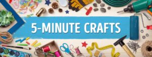
The earliest logo variant for 5-Minute Crafts was crafted in 2016, and it featured a straightforward, playful design. It used a light-yellow background, among other colours, to convey energy, creativity, and friendliness—qualities that are central to the brand’s appeal to a global, family-oriented audience. The logo featured the slightly slanted brand name in white uppercase letters in a sans-serif typography set against a narrow blue rectangular background.
The narrow, horizontally oriented rectangular band was formed out of a paintbrush roll and set against a light-yellow background. Surrounding this blue band and light-yellow background were several DIY lifehack tools, such as scissors, pencils, hammers, photo frames, and other elements in various colours. The original logo gave the exact impression of a channel that showcases lifehacks, crafts, and others.
(2022 – Present)
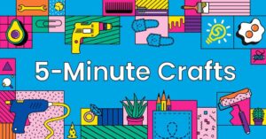
The 2022 logo was a refinement of the earlier logo where the narrow blue band gave way to a fuller background. At the centre of the logo appears the brand name in title case in white and in a sans-serif typeface. It was surrounded by various DIY tools for home improvement, crafts, and others, organised and placed neatly, unlike their cluttered presence in the previous logo. The clean imagery of the tools made the logo visually identifiable, especially conveying the purpose of the brand.
The Elements of the 5-Minute Crafts Logo
Font
The 5-Minute Crafts logo employs a sans serif font due to its clean, minimalistic, and highly readable style on screens. Besides, the font conveys modernity, straightforwardness, and accessibility and aligns well with the image of 5-Minute Crafts. The font is likely customised to maintain uniqueness while remaining friendly and straightforward.
Colour
The 5-Minute Crafts logo uses an assortment of colours, with blue being the dominant one in the background. The other colours are yellow, red, orange, pink, white, green, purple, and black, among others. The use of such a wide range of colours is to convey the identity of the brand as a source of quick, fun, and creative inspiration.
Finally
The 5-Minute Crafts logo has evolved from a simple, playful design to a highly optimised, versatile emblem of one of the world’s most-followed DIY brands. Its history reflects the channel’s growth, the changing landscape of digital media, and the importance of clear, consistent visual branding in building a global audience.