Ross Stores is a prominent American retail chain known for offering a wide range of branded apparel, footwear, accessories, and home décor at discounted prices. Based in Dublin, California, USA, Ross Stores targets budget-conscious shoppers by providing quality merchandise at savings of 20% to 60% off department and speciality store prices.
Founded in 1982, Ross Stores continues to be a major player in the retail landscape, especially with consumers who seek value and affordability in their shopping choices. The visual identity of Ross Stores has undergone a few changes, which are discussed in this article, among other details of the company.
The Genesis of the Ross Stores Logo (1950 – 196?) (Unavailable)
Ross Stores originated in 1950 when Morris Ross opened the first department store in San Bruno, California. There is no archival evidence of the original logo, but it likely featured the brand name using straightforward typography. It would have emphasised the Ross name without any distinctive branding elements, which was common for regional department stores at the time.
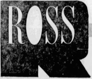
(196? – 1969)
The first logo change took place somewhere in the sixties, and it featured the wordmarks “ROSS” and “Pacifica” in white set against a massive letter “R” in black acting as a background. The letter “O” in Ross was a solid white, and the letters had elongated serifs.

(1969 – 1972)
In the 1969 logo variant, the wordmark “Pacifica” was removed, while the rest of the elements were retained.
(1972 – 1973)
In the logo design of 1972, the brand name was written in a bold, geometric, rounded, sans-serif typeface in black against a white background. The individual letters of the wordmark seem to be stretched at their edges.

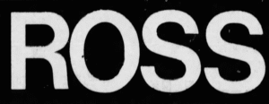
(1973 – 1976)
The logo design of 1973 was similar to the 1969 one, but without the massive letter “R” acting as the background. It featured the letters “Ross” in white uppercase in a sans-serif typeface against a black rectangular background.
(1976 – 1982)
The 1976 variant featured the words “ross” and “northern california” in a horizontally oriented rectangle that was divided into two parts. The left had the wordmark “ross” in black lowercase against a white background, while the right had the wordmarks “northern california” in white lowercase set against a black background in two levels.

(1982 – 1983)
The logo from this era featured bold, sans-serif lettering to emphasise clarity and affordability. The colour palette shifted toward blue and white, colours that are commonly associated with trust, value, and accessibility in retail. The wordmarks “Ross” and “Dress for less” in blue uppercase had a bold customised typeface. Certain letters in the wordmarks had disjointed ends, which gave them a stylised look.

(1983 – 1996)
As Ross Stores expanded rapidly across California and into new markets following its 1985 IPO, the logo underwent subtle refinements. This was done to enhance recognition and consistency across hundreds of locations. For instance, the logo became more streamlined, with cleaner lines and a more uniform typography. The blue-and-white colour scheme was retained to reinforce the brand’s association with value and reliability.

(1996 – Present)
The current logo features a distinctive, rounded sans-serif typeface with the word “ROSS” in large, bold letters. It is also accompanied by the tagline “Dress for Less” in smaller text below. The logo’s blue colour was made a little light to enhance its appeal in both physical and digital environments. The colour scheme used to design the logo is called “cyan-blue azure.” The contemporary design is minimalist and focuses on legibility and instant brand recognition.

The Elements of the Ross Stores Logo
Font
The wordmark that forms the Ross Stores logo is written using a custom, rounded sans-serif typeface. The letters are bold, clean, and geometric and are designed to maximise legibility and brand recognition.
Colour
The signature colour of the Ross Stores logo is a vibrant shade of blue, which is officially described as “cyan-blue azure”. The colour blue symbolises trust, reliability, and value—qualities central to the Ross brand identity.
Finally
The Ross Stores logo has evolved over the years. It changed from a modest, utilitarian mark to a bold, contemporary emblem that reflects the company’s status as a national leader in off-price retail. Each iteration of the logo has shown key moments in the company’s history. The Ross Stores logo serves as a visual symbol of its enduring commitment to value and accessibility for consumers.