Etisalat, or Emirates Telecommunication Group Company, was founded in 1976 in Abu Dhabi. It has since grown from a national telecommunications provider into a global technology and investment conglomerate. The company operates in fifteen countries across the geographies of the Middle East, Asia, and Africa and offers a host of services.
The services include mobile telephony, fixed-line voice and data services, IPTV, and broadband connectivity. Its logo has evolved significantly over nearly five decades and reflects the company’s expanding ambitions and the shifting landscape of the telecom industry. The article explores the logo changes undertaken by Etisalat over the years, among other details.
The Genesis of the Etisalat Logo (2000 – 2006)
The original Etisalat logo was introduced in 2000, and it featured a red dot and three blue curves over a dark green square. The red dot represented the origin of a signal, while the blue curves symbolised the propagation of that signal. These were explicit visual metaphors for mobile communications. At the top of the green square was mentioned the brand name in Arabic, while the bottom of the square saw the brand name in English – all in blue.
(2006 – 2022)
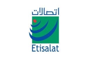
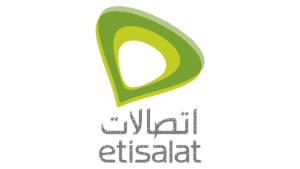
The 2006 logo symbolised a slanted water drop turned upside down. It represented communication as a liquid flowing, similar to the other logos of telcos. The logo comprised the water drop emblem in various shades of green to represent the national colour of the UAE. The colour symbolises life, renewal, and growth. And below the emblem was written the name of the company in grey. The name was executed in both Arabic and English in two levels.
(2022 – Present)
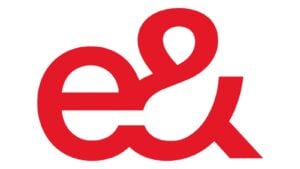
On February 23, 2022, Etisalat Group announced a transformative rebrand. Consequently, it adopted the new group identity “e&” to reflect its evolution into a global technology and investment conglomerate. The UAE telecom business was rebranded as “etisalat by e&” to align the local brand with the parent company’s new vision while maintaining its established name in the UAE.
Two variants of the logo were created, where the first features a horizontal rectangle in black and red with rounded angles. On the left black part of the rectangle is written “Etisalat” in white lowercase and in a modest sans-serif typeface. The smaller red part of the rectangle on the right has the lowercase “by” and the merged elements of “e” and the ampersand sign – in white.
The lowercase “e” represents “electronic” and “ethernet”, while the ampersand “&” symbolises the expanding range of services. The modern, dynamic, and customer-centric design signals Etisalat’s focus on digital transformation and innovation.

(2022 – Present)
In another logo version unveiled in the same year (2022), the lowercase “e” and the ampersand (&) were displayed in a dark red colour against a white background. The merged elements were executed in thick clean lines with their ends showing straight cuts.
The Elements of the Etisalat Logo
Font
The Etisalat logo uses the ITC Benguiat Gothic Std Medium font for its English text. Designed by Edward Benguiat, this typeface is a modern sans-serif font that combines clarity with a distinctive, slightly geometric style. The font makes it suitable for a technology and telecommunications brand. The font conveys professionalism, modernity, and approachability.
The Arabic part of the logo was created by Tarek Atrissi Design. This Arabic typography harmonises with the Latin font and preserves the spirit of traditional Arabic script.
Colour
The current logo of Etisalat employs a colour palette comprising black, red, and white.
Finally
The various changes to the Etisalat logo show the transformation of the company from a national telecom provider to a global technology leader. Each rebranding phase has been carefully aligned with major strategic shifts—whether embracing mobile technology, expanding internationally, or leading digital transformation. Today, “etisalat by e&” stands as a symbol of both heritage and forward-thinking innovation. It is poised to connect and empower societies in a hyper-connected world.