Hulu is an online video service from the house of Disney that was launched in 2007. It has since grown from a disruptive streaming startup to a major force in the world of digital entertainment. With nearly fifty-four million users globally, the service offers a wide range of movies and TV series by subscription. The evolution of its logo shows the journey of the company and the changes in ownership, design trends, and brand strategy. The article describes the various logo changes undertaken by the video service, among other details about the company.
The Genesis of the Hulu Logo (2007 – 2014)
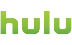
The inaugural logo of Hulu was introduced in 2007, and it featured a simple, lowercase wordmark in a custom geometric sans-serif font. The letters were rendered in a gradient green colour scheme. It had a lighter shade on top and a darker shade at the bottom and was set against a white background.
The choice of green was deliberate, for it symbolised growth, freshness, and renewal. The minimalist, approachable design reflected Hulu’s mission to provide easy access to streaming television and films, and the lowercase style conveyed friendliness and accessibility.
(2014 – 2017)
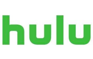
In 2014, Hulu updated its logo but retained the core elements – the wordmark in a geometric sans-serif typeface in lowercase. The main change was the colour – the green was refreshed to a brighter and more vivid tone, and the gradient was removed. It resulted in a flat, modern look that aligned with contemporary digital design trends. This update reinforced brand continuity and signalled Hulu’s growth and its rising status in the streaming landscape.
(2017 – 2018)
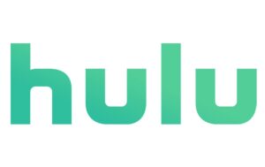
After WarnerMedia acquired a stake in Hulu in 2016, the logo underwent subtle adjustments in 2017. The colour scheme changed to a turquoise-green with a restored gradient. This introduced a cooler and more relaxing tone that suggested creativity and imagination. The changes were, however, subtle but intended to modernise the logo.
(2018 – Present)
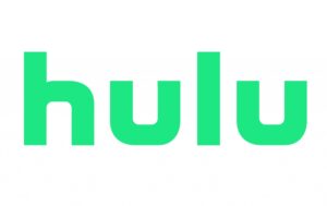
In 2018, Hulu introduced its most significant logo update since launch. The new design by the London-based studio DixonBaxi featured a brighter and more energetic green. It eliminated gradients in favour of a flat, streamlined appearance. This redesign aimed for greater visibility and consistency across digital platforms, besides embracing minimalism and modernity. The logo’s geometric sans-serif typeface was retained to reinforce brand recognition and continuity.
The Elements of the Hulu Logo
Font
The wordmark that forms the visual identity of Hulu is written using a custom geometric sans-serif font. It conveys modernity and accessibility, with lowercase letters enhancing approachability. The font is similar to the commercial Futura Md BT typeface.
Colour
Green has remained the central colour of Hulu, and it symbolises growth, harmony, and progressiveness. The specific shade has evolved to keep the brand fresh and relevant.
Finally
The journey of the Hulu logo and its variations from a simple green wordmark to a vibrant, modern design encapsulates the platform’s growth and adaptability. Each iteration has balanced continuity with innovation and reflects Hulu’s evolution from a startup to a streaming powerhouse.