Dude Perfect is an American sports and comedy group that has become one of the most recognisable brands on YouTube and in digital entertainment. It was founded in 2009 by five friends—Tyler Toney, Coby Cotton, Cory Cotton, Garrett Hilbert, and Cody Jones—while they were students and roommates at Texas A&M University. Since then, Dude Perfect has grown into a global media powerhouse.
Along with their content, visual identity too has evolved. The Dude Perfect logo has undergone a few changes, where each logo change reflects the growth and branding ambitions of the group and its connection with fans. The article explores the various logo changes of Dude Perfect, among other details, about the brand.
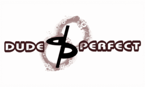
The Genesis of the Dude Perfect Logo (2009 – 2010)
Dude Perfect’s first logo was introduced along with their earliest YouTube videos. This design featured a black, rounded lowercase “d” and “p” connected at the corners to form the monogram “DP”. The logo was set against two painted rings in brushed brown tones with smaller white rings layered over them. The words “DUDE” and “PERFECT” appeared in white with brown outlines on either side in a futuristic stencil sans-serif font
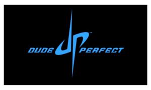
(2010 – 2011)
The second logo introduced a more stylised and symmetrical “dp” monogram in light blue and placed centrally on a black background. The letters “d” and “p” in the monogram had their vertical bars sharpened and extended vertically. The trademark symbol was added to the top right to signify the group’s growing professionalism and brand awareness. The logo was flanked by “DUDE” and “PERFECT” in an uppercase italicised sans-serif typeface on either side in blue to maintain clear brand visibility.
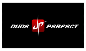
(2011 – 2012)
The 2011 logo variant was designed using the colour palette of black, white and red. Here, the letters of the monogram were designed in white, while the background appeared in black. The monogram was placed on a red square with a smooth gradient and rounded corners. The wordmarks “Dude” and “Perfect” in white italicised uppercase got more distinct and bolder.
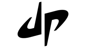
(2012 – Present)
The current logo was designed in 2012, and it consisted of a bold monogram placed above the brand name written in an uppercase sans-serif typeface. Interestingly, the wordmark “Dude” was executed in a heavier bold font compared to a lightweight font for “Perfect”. The “DP” monogram in lowercase features swoosh-like shapes to evoke a sense of movement. The letters “d” and “p” display the same contours and mirror each other as they are placed upside-down.
The Elements of the Dude Perfect Logo
Font
The monogram that forms the Dude Perfect logo is bold, minimalistic, and stylish. It is designed in a sans-serif typeface in lowercase. The logo with the wordmark has the word “Dude” written in bold Bebas Neue or Trade Gothic typeface. On the other hand, the word “Perfect” is written in thin Roboto.
Colour
The Dude Perfect logo comes in two colour variants. The first comprises the monogram and wordmarks in black against a white background. The second comprises a black background and the characters in the aquamarine neon spectrum.
Finally
The Dude Perfect logo and its variants show how the group grew from college roommates filming backyard trick shots to global entertainment icons. Each logo iteration has marked a new chapter in their story, which blends creativity, professionalism, and a deep connection to their roots in sports and friendship.