Saudi Telecom Company, or STC, is a leading provider of telecommunications services in Saudi Arabia, the Middle East, and parts of Asia. It was founded on April 21, 1998, by the government of Saudi Arabia. The company offers a wide range of services, such as fixed-line, mobility, broadband internet, and digital television.
The visual identity of STC reflected its role as a state-owned telecom provider. The original logo was formal and institutional and was designed to communicate trust, national pride, and reliability. The article delves into the various logo variants of STC, among other details, of the company.
The Genesis of the STC Logo (1998 – 2008)
The original logo featured the brand name in both Arabic (above) and English (below) and an emblem. The brand name in both languages was in light blue colour, and the letters in English had subtle curves and serifs. The emblem to the right of the wordmarks had two interconnected chain links in blue and orange-yellow against a white background at the core. The links symbolised universal connection, which is the essence of telecommunications. The links were present inside a square with yellow and blue accents at the top and bottom.

(2008 – 2015)
In 2008, the logo was changed, and the brand name of the company was abbreviated to “STC”. The letters formed by the strokes of equal thickness were placed to the left of the emblem. They were written in a simple sans-serif typeface. The Arabic lettering showed the full name of the company but was made smaller and positioned below the English version.
The emblem to the right had new vibrant colours, such as shades of light and dark purple, along with several shades of yellow. Its abstract shape looked more like an ice cream or a bird. The gradient used in the emblem gave it a three-dimensional effect.
(2015 – 2019)
The logo of 2015 was a refined version of the previous logo. For instance, the ends of the letters had diagonally rounded ends, which gave them a dynamic style. The emblem too was refined, albeit subtly.
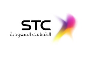
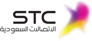
(2019 – Present)
In December 2019, STC unveiled a bold new logo and brand identity designed by Interbrand. It features a clean, lowercase “stc” in a modern, sans-serif LL Circular typeface. A tiny portion at the top of the letter “t” seems to be shifted out to reveal a tiny white square.
The simplicity and confidence of the design reflect the digital-first strategy and approachability of the company. The purple colour was chosen for its distinctiveness in the regional telecom market. It also helped STC stand out from competitors who traditionally use blue or green.

The Elements of the STC Logo
Font
The monogram “stc” is written in a customised, modern sans-serif LL Circular typeface with classic proportions.
Colour
The STC logo uses a two-colour combination of purple and white.
Finally
The STC logo and its variants are a case study in how visual identity can reflect and drive business transformation. Each iteration of the logo has marked a new phase in the company’s journey, that is, from a national telecom operator to a leading digital enabler in the Middle East. This is in alignment with the Kingdom’s vision for a modern and diversified economy.