Zee Entertainment Enterprises (ZEEL) is one of the biggest media conglomerates in India. It offers a wide range of programming content across television, digital, and OTT platforms. It is also involved in music, film production, streaming, and theatrical production. Its logo has evolved in tandem with its growth, technological advancements, and changing audience preferences. The company’s visual identity has undergone several changes since its inception, where each reflects a new phase in the brand’s journey. The article explores the various logo changes of Zee Entertainment, among other details, over the years.
The Genesis of the Zee Entertainment Logo (1992 – 2000)
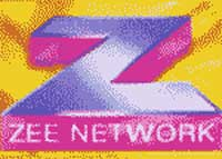
When Zee TV was launched on October 2, 1992, it introduced a bold and vibrant logo that set it apart from state-run broadcasters. The original design featured a massive, geometric “Z” in light dotted pink and orange set against a blue square background. The base of the letter “Z” in orange served as the backdrop for the wordmark “Zee Network” in uppercase. Written in a black sans-serif typeface, it provided a professional yet energetic look.

(2000 – 2005)
In 2000, the above logo was refined, especially in its colour. The massive “Z” was reproduced in a combination of purple with a gradient and deep pink set against a yellow square with red accents. The wordmark “Zee Network” in uppercase was written in white.
(2005 – 2011)
In 2005, the central “Z” was rendered in an upright position in gradient purple and blue colours. It was placed at an angle on a yellow square with rounded corners. This time around, the wordmark “Network” in light purple uppercase was written in a custom typeface at the bottom of the yellow square. The logo’s diagonal tilt and dynamic colours reflected Zee’s growth and contemporary appeal.

(2011 – 2013)
In 2011, another major logo change brought a sleek, upright “Z” in a gradient turquoise palette, split by a wavy swoosh-like white element. The wordmark “ZEE” below in uppercase appeared in the same colour palette and was written using the Helvetica typeface with adequate spacing between letters. The stylised “Z” evoked the shape of a swan or the digit “2” to symbolise elegance and transformation.

(2013 – 2016)
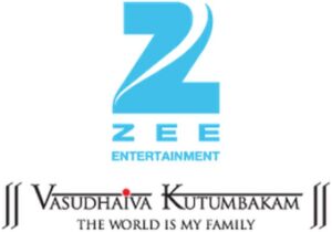
The Zee Entertainment logo was again refined in 2013. The previous logo was retained with the addition of the wordmark “Entertainment” in blue uppercase just below “ZEE.” At the bottom of the logo was mentioned the tagline “Vasudhaiva Kutumbakam” in uppercase, which translates to “The World Is My Family.” In the tagline, the first letters “V” and “K” were bigger than the rest and two thin lines appeared on top of the letters. Additionally, a red dot appeared on top of the letter “I”. This minimalist approach signalled a move towards simplicity and digital readiness.
(2017)
The 2017 logo was a refined variant of the previous logo where the gap in the top right corner of the upright letter “Z” was closed. Also, the white swoosh-like element within was modified. The wordmarks “ZEE” and “ENTERTAINMENT” remained the same.

(2017 – 2025)
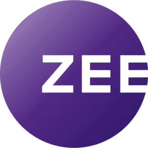
In 2017, the logo was redesigned by Lambie-Nairn, and it featured the brand name “ZEE” in white written in a modified Gotham typeface. The wordmark was placed to the right of the centre of a solid ring in gradient purple.
(2025)
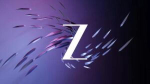
The latest Zee logo has been developed by the in-house team of Zee TV in collaboration with its creative agency Draft FCB-Ulka. The new tech-infused logo features an abstract form of the letter “Z” in a stylish font and in a combination of light purple with a gradient, aqua blue, and white colour scheme. This has been done in view of the company’s rebranding from “Zee” to “Z” to symbolise the young, emerging India and its future aspirations.
The rebranding also comes with a new tagline, “Yours Truly Z”. The upward flourish of the logo design represents the movement of desires and wishes. The vibrancy of the aqua blue colour delivers a feeling of modernity and freshness to the brand. The new “Z” symbolises the confidence of today’s woman to step out into the world beyond her home. The new logo design conveys a future filled with hope and positivity.
The Elements of the Zee Entertainment Logo
Font
The font used in the Zee TV logo is a custom-designed, bold sans-serif typeface. This choice focuses on clarity and modernity and maintains a professional appearance. The letter “Z” in the logo has an abstract design that incorporates upward flourishes to symbolise growth and aspirations. This stylisation reflects the movement of desires and wishes of a young and emerging India and its future aspirations.
Colour
The current logo prominently features a combination of a light purple with a gradient, aqua blue, and white colour scheme.
Finally
The Zee Entertainment logo and its various iterations show the journey of the company from a trailblazing private broadcaster to a global media and technology powerhouse. Each logo redesign has balanced continuity—the iconic “Z”—with innovation, which reflects Zee’s adaptability and enduring connection with its audience.