Procter & Gamble (P&G) was founded in 1837, and it is arguably one of the world’s largest consumer goods companies. The company has several well-known brands under its fold, namely, Ariel, Oral-B, Always, and Gillette. The logo of Procter & Gamble has undergone several changes over nearly two centuries. These logo changes reflect both the growth of the company and its responses to public perception. The article takes a detailed look at the evolution of the P&G logo, among other details.
The Genesis of the Procter & Gamble Logo (1837 – 191?)
Procter & Gamble was established on October 21, 1837. Its original logo is not available today, but it had the moon and stars.
(1845 – 1853)
In 1845, P&G barge workers on the Ohio River began marking cases of star candles with a crude cross to identify the company’s goods. This symbol was made into the official trademark of the company in due course.

(1853 – 1859)
In 1853, P&G introduced a new emblem: a single thick, black star within a thick circle against a white background. The two elements were enclosed within a larger circle with a thin outline in black.

(1859 – 1875)
In 1859, the logo design evolved to include a crescent moon and 13 stars to symbolise the original Thirteen Colonies of the United States. There were also thick contours representing the visage of a man to the right.

(1875 – 1882)
In 1875, the moon-and-stars logo was refined for greater clarity and transparency. The “Man in the Moon” logo became the first widely recognised trademark of the company.

(1882 – 1890)
The moon and stars logo with the visage of a man was modified. It featured white stars against a black background and the white-and-black contours of a man’s face.

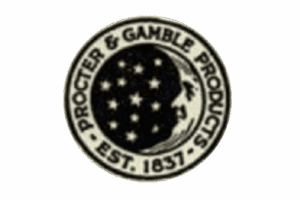
(1890 – 1930)
In 1890, the logo gained a double black outline and included the inscription “Procter and Gamble Product CST 1847” in thick, black, uppercase. The moon was thinner and nearly merged with the frame.
(191? – 1930)
A more stylish logo presentation came out during the period. It featured the brand name in stylish stencil lettering in black with shadows on either side of the moon and stars roundel. Below the crest-like roundel was written the word “Company” in white uppercase against a black stand.
(1930 – 1944)
The previous logo was refined by placing the brand name in white against a black scroll at the bottom. Above it was placed the crest-like emblem in a metallic colour. The logo had ornate markings at the top and sides.

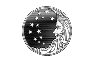
(1930 – 1989)
In this logo iteration, the frame and brand name were removed. The moon’s face in the roundel was drawn with more detail, and it looked at the stars against horizontal monochrome stripes acting as the background.
(1989 – 1998)
In 1989, the previous logo was refined further. The monochrome striped background within the double-outlined roundel was replaced by a black colour scheme.

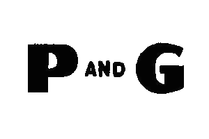
(1944 – 1953)
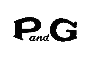
In 1944, the roundel was removed, and in its place came the letters “P” and “G” in extrabold, uppercase, and enlarged monochrome. Between the two letters was placed the word “AND” in black and in a small size.
(1953 – 1989)
The logo of 1953 almost retained the design and colour palette of the previous variant. However, the contours of the two letters were changed to elegant serifs. Further, the “And” was written in a cursive custom serif font in lowercase.
(1989 – 1990)
In 1989, the logo first appeared in blue and featured the letters “P&G” in a solid sans-serif typeface. The previous roundel with a moon, stars, and the visage of a man appeared to the right of the lettering in royal blue and white colours.

(1995 – 2003)
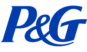
The text-only “P&G” logo became the company’s official mark to emphasise clarity and professionalism. The colour palette of royal blue and white was retained to reinforce a sense of reliability and protection. Further, the tail of the “&” sign extended to cover the letter “G”.
(2003 – Present)
In 2003, the “P&G” logotype in intense blue and white appeared in a slanted serif typeface to represent reliability and protection.

(2012 – Present)
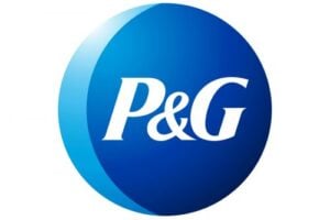
In 2012, P&G unveiled a new logo designed by Landor Associates. This version featured the “P&G” logotype in white inside a slightly right-facing dark blue circle. It has a subtle light blue crescent that is reminiscent of the old moon and stars symbol. The design aimed to reconnect with the company’s heritage while presenting a modern, unified corporate image. Internally, it is called the “New Phase” logo to symbolise a new era and the phases of the moon.
The Elements of the Procter & Gamble Logo
Font
The emblem in the Procter & Gamble logo is designed using a minimalist serif typeface, which is similar to Helvetica. The letters used in the emblem are in uppercase and italicised.
Colour
The Procter & Gamble logo employs a combination of blue (in various shades) and white.
Finally
The Procter & Gamble logo and its various iterations over the years reflect the journey of the company from a local soap and candle maker to a global consumer goods powerhouse. Each logo iteration has balanced heritage and modernity, with the current logo subtly honouring its past while projecting a professional, unified image for the future.