Vodacom is one of Africa’s leading telecommunications companies and a subsidiary of the global Vodafone company. Established in 1994, the evolution of its logo reflects both changes in corporate identity as well as shifts in the broader telecommunications landscape. Besides, it also shows the influence of its parent company, Vodafone. The article explores the evolution of the Vodacom logo since the establishment of the brand.
The Genesis of the Vodacom Logo (1994 – 2011)
When Vodacom was founded in 1994, its original logo featured a blue and green colour scheme. It symbolised trust, reliability, and growth – qualities that were essential for a new telecommunications provider in a rapidly liberalising South African market. The logo included the Vodacom name in a bold, modern font in lowercase, which is often accompanied by a stylised graphic element that represented connectivity and communication.
Besides, in the wordmark “vodacom”, “voda” appeared in a bold, deep blue colour, while “com” appeared in green. This branding was distinct and helped Vodacom establish itself as a household name during South Africa’s post-apartheid telecommunications boom.

(2011 – 2018)
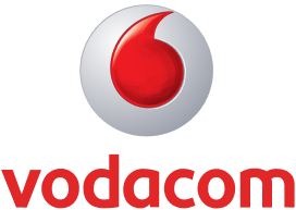
On 1 April 2011, Vodacom officially unveiled a new logo variant that replaced its longstanding blue and green colours with the iconic red and white of Vodafone. This move aligned Vodacom visually with its global parent while retaining the Vodacom name. This became the representation of the first Vodafone subsidiary. The new logo introduced the Vodafone “speech mark” (often mistaken for a teardrop) as a central visual element. It symbolised conversation and connectivity. The wordmark in red lowercase was written using a modern typeface, and the overall look became cleaner and more dynamic. The font reflected the forward-looking approach of the company.
(2018 – Present)
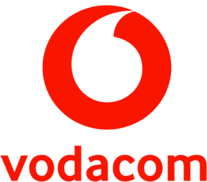
In 2018, the Vodacom logo that continues to this day featured a flat, two-dimensional version of the speech mark. This change was designed to make the logo more adaptable for digital platforms and to give it an iconic status, similar to the Nike “swoosh”. The red colour was retained, but the font was further updated to enhance modernity and readability.
The Elements of the Vodacom Logo
Font
The font used to write the wordmark in the Vodacom logo is a clean, sans-serif typeface. The typeface is characterised by rounded edges, balanced proportions, and readability. It is designed to convey clarity, modernity, and approachability. In fact, the font is similar to fonts like Helvetica or Arial Rounded. This choice of typeface aligns with Vodacom’s identity as a reliable and forward-thinking telecommunications provider. The rounded elements in the font also give the brand a friendly and customer-oriented feel, and increase its appeal to a broad audience.
Colour
The Vodacom logo employs a red and white colour combination. The colour red, specifically a bold and crimson red, is chosen to evoke attributes such as energy, passion, confidence, and urgency. Besides, in branding, red often represents strength and action, which suits Vodacom’s role in fast-paced digital communication. The white colour in the logo is used as the surrounding background to enhance readability and create a clean, high-contrast look.
Finally
The Vodacom logo and its various iterations – from its original blue and green identity to the bold red speech mark – display the growth of the company from a national telecom upstart to a major player integrated into Vodafone’s global network. Each redesign has modernised the brand’s appearance and has reinforced its commitment to innovation and connectivity across Africa.