Discord, developed by Jason Citron and Stanislav Vishnevskiy, is an online messenger app available in thirty languages. It is used by a large section of users – gamers, students, music lovers and crypto enthusiasts. Since its launch in 2015, it has rapidly grown from a niche tool for gamers into a global communication platform for communities of all kinds. Central to its identity is its instantly recognisable logo, which has undergone just one change over the years. The article explores the logo changes for Discord since its inception.
The Genesis of the Discord Logo (2015 – 2021)
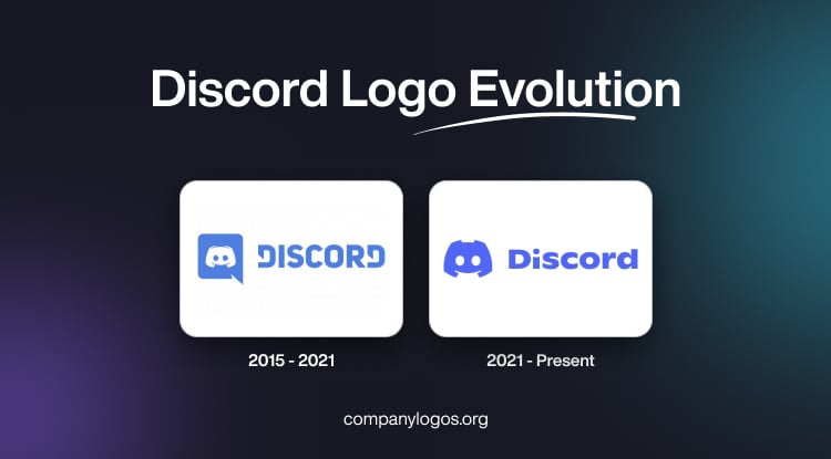
When Discord debuted in 2015, its logo was designed to be both simple and meaningful. It targeted the gaming community while signalling its core function as a chat platform. The original logo consisted of two main elements. To the left there was a stylised character named “Clyde” enclosed within a blue and white speech bubble. Clyde’s design was intentionally abstract and meant to resemble a game controller. It had arched grips that doubled as a smile and blue “joystick” eyes. This playful ambiguity led to some users seeing Clyde as a crab or another creature. However, its unique shape quickly became iconic within the gaming community.
To the right of the emblem, the word “DISCORD” appeared in a bold, blocky uppercase geometric sans-serif typeface to reinforce the platform’s modern and tech-forward image. The letters “D” at the front and end had their vertical bars cut diagonally. The blue and white colour palette of the logo provided a clean, approachable look. At the same time, the speech bubble clearly communicated the platform’s chat functionality.

(2021 – Present)
In May 2021, to mark its sixth anniversary, Discord unveiled a refreshed logo that aligned with contemporary design trends. In this logo variant, the speech bubble was dropped, which allowed Clyde to stand alone as the central icon. This shift made the logo more minimalistic and versatile and reflected Discord’s broader appeal beyond gaming.
The Clyde mascot was simplified and modernised and appeared in a vibrant custom blue-purple shade known as “Blurple”. Clyde’s design became more readable and visually impactful, and it better resembled a modern game controller while maintaining its friendly, smiley character. The wordmark was redesigned in a new, custom font based on the Ginto typeface. The updated style used small capitals, with only the first letter capitalised. It made the brand feel more approachable and contemporary.
The new logo colour scheme featured a brighter and more dynamic blurple. It enhanced the brand’s digital presence and made the logo stand out across devices and platforms.

The Elements of the Discord Logo
Font
The Discord wordmark is rendered in a customised sans-serif typeface in uppercase. The font is similar to traditional fonts, such as Compose Black or Uni Sans Heavy.
Colour
The colour palette employed by the Discord logo is a shade of blue-violet against a white background. Here, blue conveys reliability, safety, and trustworthiness, while white stands for purity, loyalty, and togetherness.
Finally
The evolution of the Discord logo shows the platform’s journey from a gaming-centric chat app to a universal hub for digital communities. Its transformation from a speech bubble with a playful mascot to a streamlined, modern icon demonstrates Discord’s adaptability and focus on clear, effective branding. Today, Clyde stands as a symbol of connection, creativity, and community in the digital age.