Star Sports is a leading sports broadcaster in India and was launched in 1991 as Prime Sports. Owned by the Walt Disney Company, it operates several channels, including several Indian regional channels. It majorly competes with Sony Pictures Sports Network and Eurosport. The Star Sports logo has undergone several changes since its inception.
The evolution of its logo reflects both the changing landscape of sports broadcasting and the network’s ambition to offer sporting excellence in India. The article delves into the various logo changes of Star Sports, among other details, that have taken place over the years.
The Genesis of the Star Sports Logo (1991 – 1993)
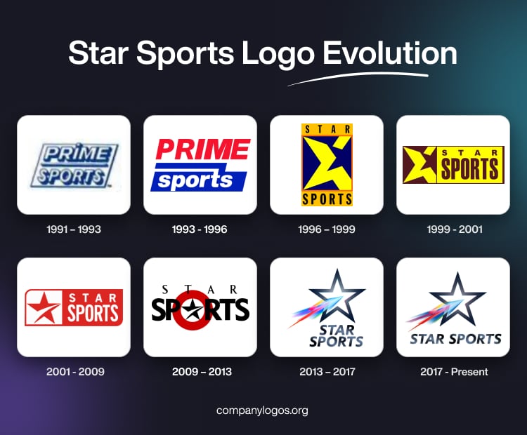
The channel began as Prime Sports, which was a joint venture between the Hong Kong-based Star TV and the American company TCI. During this period, the original logo aligned with the Prime Sports brand and displayed a simple, international sports channel identity. It featured the right-tilted wordmark “Prime Sports” in two levels and enclosed within a slanted square.
The letters of the wordmark were written in white uppercase but with a double blue outline and shadows. The two wordmarks “Prime” and “Sports” were set against a white background and were separated by a thin line of the same colour characteristics.

There was also an alternate variant with blue as the background colour.

(1993 – 1996)
The 1993 logo variant featured the brand name in two levels and in two colour schemes. The top level featured the word “Prime” in bold, red uppercase, while the bottom level showed “Sports” in white lowercase. The lower-level wordmark in a smaller size was set against a deep blue background. Also, the upper part of the letter “t” was extended to the left to form a separator between the two wordmarks.

(1996 – 1999)
The logo during this period featured a vertically aligned rectangle in light orange. The top segment of the rectangle showed the wordmark “Star” in black uppercase with adequate spacing between the letters. The lower segment, on the other hand, showed the wordmark “Sports” in black uppercase. The centre of the rectangle featured a thick yellow star image broken at the top and set against a black background with an orange outline.

(1999 – 2001)
The 1999 logo variant showed a horizontal rectangle divided into two parts. The left part constituted the thick yellow star image with a broken end that was introduced in the previous version. The star image was placed against a brown background. To the right of the star emblem appeared the brand name in two levels and against a white background. The top level showed “Star” in brown uppercase with adequate spacing between letters. The lower level showed “Sports” in a bigger size.

(2001 – 2009)
The 2001 logo was a refinement of the previous logo in a red and white colour combination. Here, the left part of the horizontal rectangle showed a four-pointed star in red with a sharp white accent against a white background. The right side of the rectangle showed the brand name in white uppercase and in two levels against a red background. The top left and bottom right ends of the rectangle were rounded for better visual aesthetics.

(2009 – 2013)
The 2009 logo variant showed the black star with a white accent at the centre and enclosed within two concentric circles in white and brown. The brand name in two levels and sizes appeared on the foreground of the star emblem.

(2013 – 2017)
On 6 November 2013, Star Sports underwent a rebranding. The network unified its diverse channels under one brand name and introduced a new logo. It was a metallic star with an explosive, incandescent trail. The new design was created by the Star India broadcast design team in collaboration with UK-based brand consultancy Venturethree and LA-based studio Capacity. The brand name in black was placed beneath the emblem in two levels and was written using the Nobel typeface.

(2017 – Present)
The latest logo of Star Sports was designed in 2017, and it was a refinement of the earlier logo. The metallic star emblem with an incandescent trail within had multiple colours and a thick black outline set against a white background. Beneath the emblem appeared the brand name in black in a single line. The sharp, bold, and iconic star represents strength and authority. On the other hand, the incandescent, colourful trail symbolises the intensity, passion, and dynamism of sports.

The Elements of the Star Sports Logo
Symbol
The Star Sports logo features a distinctive and modern design, characterised by a sharp metallic star with an explosive, colourful trail.
Font
The font used in the logo is a clean, bold, and sans-serif typeface, which complements the dynamic and authoritative presence of the brand. This choice of typography ensures high visibility and readability, aligning with the energetic and contemporary identity Star Sports aims to project.
Colour
The Star Sports logo employs a vibrant colour palette consisting of six signature colours – Vampire Black, UCLA Blue, Brandeis Blue, Electric Pink, Banana Yellow, and Malachite. The metallic star itself utilises shades of silver and grey to create a sleek, reflective effect.
Finally
The Star Sports logo has evolved from a simple, international sports brand to a unified, dynamic, and authoritative symbol of sports broadcasting in India. The 2013 rebranding, with its metallic star and vibrant trail, marked a new era. It reflected both the network’s ambition and the passion of sports fans across the country. This evolution streamlined the brand as well as reinforced the position of Star Sports as a leader in sports entertainment.
Please change current star sports channel logo
Using 2009 logo or 2001 logo
Old Channel logo is better