Epic Games has grown from a one-man operation into one of the most influential companies in the video game industry. Founded in 1991, the journey of the company is marked by innovation, strategic decisions, and a series of industry-defining products. The Epic Games logo is one of the most recognisable emblems in the gaming industry. It symbolises innovation, creativity, and the journey of the company from a small developer to a global powerhouse. Its evolution shows how the company transformed, with each iteration reflecting changing ambitions, technologies, and branding philosophies. The article delves into the evolution of the Epic Games logo since the inception of the company.
The Genesis of the Epic Games Logo (1991 – 1992)
Epic Games was founded as Potomac Computer Systems in 1991. The initial logo of the company consisted of a two-level wordmark “POTOMAC” and “Computer Systems”. The top-level wordmark “POTOMAC” in uppercase was written using a sans-serif typeface in purple. The letters with pointed serifs were marked by black shadows that gave the impression of the letters and their shadows overlapping. The bottom level wordmark “Computer systems” was written in an italicised handwritten style in black.

(1992 – 1993)
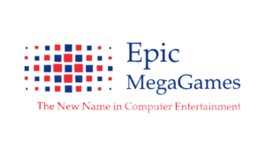
In 1992, the name of the company was changed to Epic MegaGames from Potomac Computer Systems, which necessitated a change in logo. The new logo featured the brand name “Epic MegaGames” in a thin blue serif typeface to the right of a geometric emblem. The emblem was designed using several blue and red squares of different sizes. Beneath the emblem and the brand name appeared the tagline “The New Name in Computer Entertainment” in a title case using a red colour scheme.
(1993 – 1995)
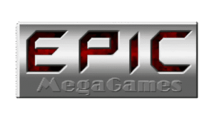
The next logo iteration was in 1993, and it featured a metallic badge with a gradient in three dimensions. Inside the badge was engraved the big-sized wordmark “EPIC” against a red and black background. Beneath it was inscribed the wordmark “MegaGames” in grey against a deep grey background, which made it almost invisible.
(1995 – 1999)
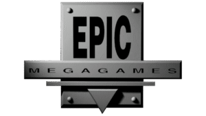
The logo of 1995 featured a vertically oriented metallic-grey rectangle with the bold word “EPIC” engraved inside in black. A thin horizontal rectangle in grey was placed in the middle and below the “EPIC” wordmark with the word “MegaGames” inscribed inside. At the bottom of the vertical rectangle appeared a sharp triangle pointed downwards and protruding out in grey, which added further strength to the logo.
(1999 – 2005)
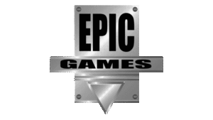
In 1999, the company dropped “Mega” from its name and became simply “Epic Games”. This marked a new era and a more focused brand identity. The previous logo iteration was refined further to make it a more dynamic, CGI-driven design. The sizes of the vertical and horizontal rectangles were reduced, and the metallic sheen was made more pronounced. The downward protruding triangle was made bigger than its previous iteration. The letters of the wordmarks “EPIC” and “GAMES” were made bolder. This logo signalled the company’s move toward modern, high-tech branding.
(2005 – 2015)
With the release of Gears of War and a shift toward console gaming, Epic Games updated its logo again. The logo became more streamlined and visually impactful. It featured a metallic-grey shield with thick contours and the brand name “EPIC GAMES” inscribed inside in two levels. Below the brand name appeared a small glowing red triangle or arrowhead pointed downwards. This design emphasised clarity and boldness and reflected the growing influence of the brand in the industry.

(2015 – Present)
The current logo of Epic Games is a study in simplicity and modernity. It features a black shield with the brand name “EPIC GAMES” in white inscribed inside using a clean, white, sans-serif typography. The shield shape conveys strength and protection, while the black-and-white palette ensures maximum visibility and timeless appeal. This minimalist approach aligns with contemporary branding trends and the company’s commitment to clarity, usability, and forward-thinking design. The logo is now instantly recognisable across platforms, from the Epic Games Store to merchandise and in-game branding.

The Elements of the Epic Games Logo
Font
The typeface is modern and straightforward, and it reflects the company’s values of innovation and accessibility. Besides, the font is highly readable and fosters instant recognition among gamers and developers alike.
Colour
The logo is designed using a black and white colour palette. Here, black symbolises sophistication and power, while white provides contrast and clarity. They ensure the brand stands out.
Finally
The Epic Games logo and its various iterations show how the company emerged as a leader in the global gaming industry from humble beginnings. Each logo redesign has reinforced the brand’s core values, which are innovation, clarity, and ambition. The logo also symbolised how the company adapted to changing trends and technologies. Today, the Epic Games logo stands as a beacon for gamers and developers worldwide and symbolises a legacy of creativity and excellence.