The Zain Group is a leading telecommunications company in the Middle East and North Africa. It was originally established as the Mobile Telecommunications Company (MTC) in 1983 in Kuwait and has since evolved into one of the most recognised telecom brands in the Middle East and North Africa. The evolution of its logo shows the transformation of the company from a national operator to a leading multinational brand. It reflects the company’s ambitions, innovation, and growing influence across the region. The article delves into the history and evolution of the Zain Group logo over the years.
The Genesis of the Zain Group Logo (1983 – 1986)
The original logo of the Mobile Telecommunications Co. (the predecessor of The Zain Group Group) featured a lone telecom reception tower in black against a calm purple-coloured background. There was also a bright blue outline and five concentric rings of various sizes in purple. The logo looked perfect geometrically and in style.

(199? – 2007)
The next logo iteration of the Mobile Telecommunications Co. comprised a graphical emblem in two shades of blue and the abbreviation (MTC) in lowercase. The emblem with its arched left side and triangular right side had an abstract image with horizontal stripes. The letter “m” in the abbreviation was italicised, and the horizontal bar of the letter “t” was shortened. Below them was written the full name of the company in a title case in blue using a bold sans-serif typeface.

(2007 – 2019)
The name of the company was changed to the Zain Group in 2007, which necessitated a change in its logo. The new logo featured a black rectangle with rounded corners having the brand name “Zain” written in a bright turquoise-green colour. Also, the letters of the brand name were written in lowercase, except for the letter “N.” There was an emblem to the left comprising the image of an abstract swirl in the shades of turquoise and purple.
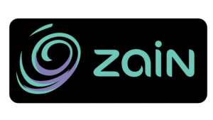
(2019 – Present)
The current Zain Group logo was introduced in 2019, and it maintains the signature swirl motif and the wordmark in black but with further refinements for digital clarity and versatility. The design is clean, modern, and adaptable across digital and physical platforms.

The Elements of the Zain Group Logo
Font
The Zain Group logo wordmark is displayed in lowercase except for the last letter “N” using a custom typeface. The letters with rounded angles had their ends slightly curved. The custom font is probably based on Como Bold.
Colour
The colour scheme of the Zain Group logo is black and turquoise, which looks fresh, young, and cool. Also, the presence of light purple, especially in the swirl emblem, makes the overall logo fancier to look at.
Finally
The Zain Group logo has evolved over the years and is a visual narrative of the company’s growth and transformation. Each redesign has built upon its predecessor and maintained the recognisable swirl motif while adapting to changing design trends and technological needs. Today, the Zain Group logo stands as a symbol of connectivity, innovation, and the company’s enduring commitment to creating a “wonderful world” for its customers.