Paramount+ is a streaming platform that offers TV shows; access to movies, sports broadcasts, and news; among others. Its rich library features a wide gamut of high-quality content, such as modern blockbusters, classic films, documentaries, children’s programming, and shows created exclusively for the platform. Paramount+ is associated with a rich cinematic history and delivers diverse content through digital streaming for everyone.
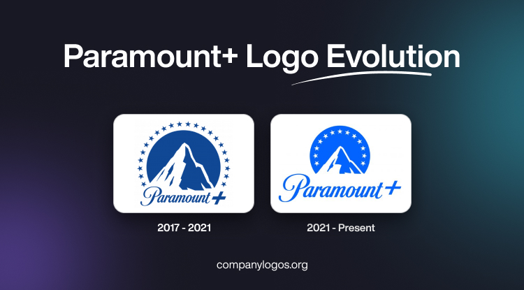
The Paramount+ logo resembles the logo of its iconic production house and is instantly recognisable for its mountain peak surrounded by stars. The article delves into the evolution of the Paramount+ logo over the years.
The Genesis of the Paramount+ Logo (2017 – 2021)
The original Paramount+ logo is a combination of a graphic emblem and the wordmark. The graphical emblem closely resembled the emblem of Paramount Pictures. The logo thus carried the rich legacy of the renowned film company. The emblem carried a pointed mountain peak at its centre and was set against a dark blue semicircle.
The silhouette of the peak displayed a large white area to be interpreted as snow. Along the circumference of the semicircle appear twenty-two five-pointed stars. Initially, these stars supposedly represented the actors who signed contracts with the company in 1914. At the bottom of the mountain base was written the brand name “Paramount+” in a signature font. The font with elegant curves, contrasting thickness, and subtle slant evoked a sense of dynamism and sophistication.

(2021 – Present)
In 2021, the Paramount+ logo retained the core elements of the classic Paramount emblem. These include the mountain, script wordmark in Peak Sans typeface, and stars. However, several changes were made for digital optimisation. The number of stars was reduced to 13, which corresponded to the number of letters in “Paramount Plus”. This change also ensured clarity and recognisability on small screens and app icons. Also, the stars were made slightly larger for better visibility in digital contexts.
The mountain’s outline was traced from the curtain-raiser video used in Paramount Pictures films, with shadows and detailing adjusted for clarity at various sizes. The colour palette shifted to a vibrant blue aka retro blue and white, which aligns with modern digital aesthetics while maintaining the brand’s heritage.

The Elements of the Paramount+ Logo
Font
The wordmark and the “+” symbol use a bespoke sans-serif typeface called Peak Sans, which was created specifically for Paramount+. The Peak Sans typeface draws inspiration from theatre marquees. It thus lends a contemporary yet classic feel that complements the wordmark and ensures readability across digital platforms.
Colour
Paramount+ uses a distinctive colour palette centred around a vibrant blue, known as “Retro Blue”. This shade is an evolution of blues previously used by CBS All Access, ViacomCBS, and Paramount Pictures. It was chosen for its visual appeal and to differentiate the brand from other streaming competitors. The blue is bright and calming, which makes it suitable for digital environments.
Finally
The Paramount+ logo stands as a testament to the brand’s ability to evolve with the times while preserving its glorious heritage. From its origins as a hand-drawn mountain inspired by a founder’s childhood memories to its sleek, digital-friendly incarnation, the logo continues to symbolise excellence in entertainment for audiences worldwide.